BACKGROUND
Trip Grid is a free app for planning and organizing all your travels. Build your trip itinerary with ease with the best selections and transportation routes at your fingertips for all your destinations. You can organize your flights and hotels, collaborate with friends about your itineraries, and save your important documents in one place. This app is designed to be stress-free and help you plan an amazing trip!
PROJECT OVERVIEW
With more and more establishments reopening and travel bans being lifted, there has been an increase in booked vacations for this year and on. Due to covid, travelers are now responsible to carry extra documentations with them; meaning extra things to remember.
The aim for Trip Grid is to be there to cut the added stress and help you plan accordingly and organize your entire trip itinerary in one app.
High Level Goals
• Design an engaging end to end mobile app that makes planning / organizing trip itineraries easy and stress-free.
• Create a cohesive / aesthetically pleasing brand identity
THE DESIGN PROCESS
I used this design thinking method as a solution based approach to solving the problem.
RESEARCH GOALS
• Identify information about digital planners and how efficient they are
• Understand how competitive travel planning apps are aiding travelers with their trip itinerary
• Learn how participants plan and organize their trips.
• What are their frustrations with the process and what do they find enjoyable
• What would they like to see in a travel planning app to better their planning experience
METHODOLOGIES
Secondary Research
• Research has shown that in the past few years digital planning is growing in popularity daily.
• It’s been said often that digital planners enhance productivity with set priorities, tracking meeting, accomplishing goals and you save money on stationery.
• There will always be the people who still prefer writing in a planner; research shows it helps with remembering tasks, events, meetings etc.
Competitive Analysis
After learning more about the digital planning industry, I wanted to take a closer look at competitor apps and see how they’re helping their users plan and organize their trips. I evaluated the strengths and weaknesses of each to see how I fill in any gaps or do things differently.
Survey Questionnaire
To gather data on participants who travel often and plan out their trips, I sent out a survey asking participants about their planning habits, what they liked and found frustrating, and discovered how familiar they were with digital planning.
After collecting enough data, I gathered the research and grouped my findings through affinity mapping and was able to develop some insights. You can take a closer look here.
Overall
What I took from my survey questionnaires is that all though some were hesitant, most were open to the idea of planning digitally. It will help with consolidation and communication in some travel situations. When designing this trip planner app, I will need to keep in mind that it will need to be accomodating, informative, functional and definitely pleasant to use. The total package or close to it.
USER PERSONA
With the insights I’ve gained from the survey results, I was able to develop the persona, Chloe Parker to help ground solutions moving forward. I highlighted the personas needs, frustrations while understanding the type of people they are.
PROBLEM STATEMENT
To help better define the problem, I created an applicable problem statement that embodies the knowledge I gained about the user and important insights from the empathy phase.
With that , I then generated a few HMW questions to allow room for ideation to create specific solutions.
Statement
Chloe needs a digital trip planner to utilize for her next trip because she’s so frustrated with all the dead end resources and countless notes.
View road map here.
APP MAP
Now it was time for me to build out the app map for Trip Grid. While mapping out the structure, I could envision the pages that would be necessary to help users navigate through the tasks that would come later.
TASK / USER FLOW
Once the app map was build, I thought about how the user would engage with specific screens to complete the simple onboarding task flow and create a new itinerary.
I then expanded that for the user flow and showcased the flow Chloe took to adding more content to her itinerary for her Barcelona trip with a few decisions along way.
You can take a closer look at the flows here.
SKETCHES
When starting the sketching phase, I wanted to focus on the key screens identified in the task and user flows; onboarding, creating a new itinerary, adding activities to the itinerary and interaction with some features. I displayed a view of my initial sketches below.
LO-FI WIREFRAMES
Moving along to the lo-fi screens, I made sure to focus on designing the screens with the intention of being functional, informative, accomodating and pleasant to use. Here are just a few of the main screens below.
MOOD BOARD / STYLE TILE
When it came to the branding, I wanted to put together a simple moodboard to convey the aesthetic of the app. With that in mind, my vision was clean yet vibrant to portray a welcoming, fun and easy to use app.
I kept the same thought process with the logo design and I also wanted it to have a rounded appearance because that style was going to be carried all throughout the app.
By now we know the name of the app is Trip Grid. It’s very straight forward; an app that helps make planning and organizing your trip grid stress-free. See what I did there!
UI KIT
The UI Kit is a compilation of all the elements and components need to build out the wireframes. It was created to ensure designs stay consistent and it also provides reference for future designs or iterations down the line.
HIGH FIDELITY WIREFRAMES
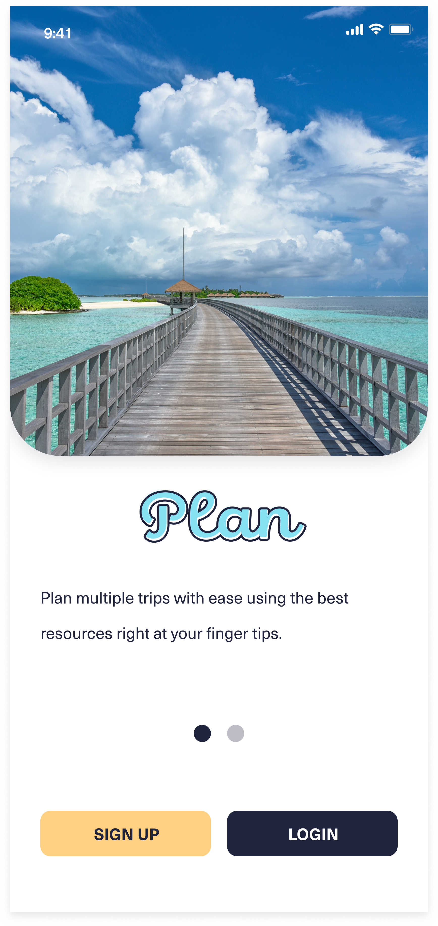
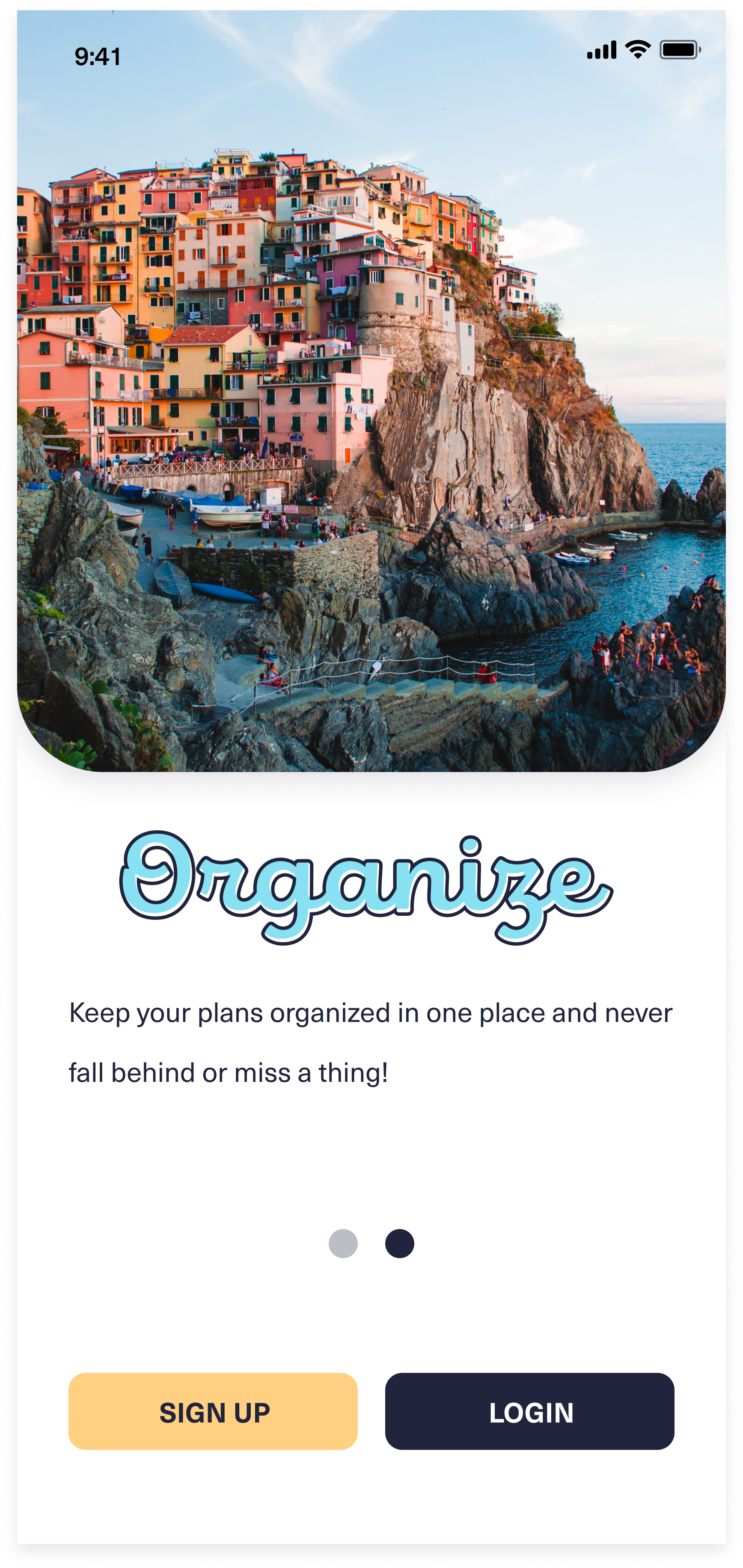
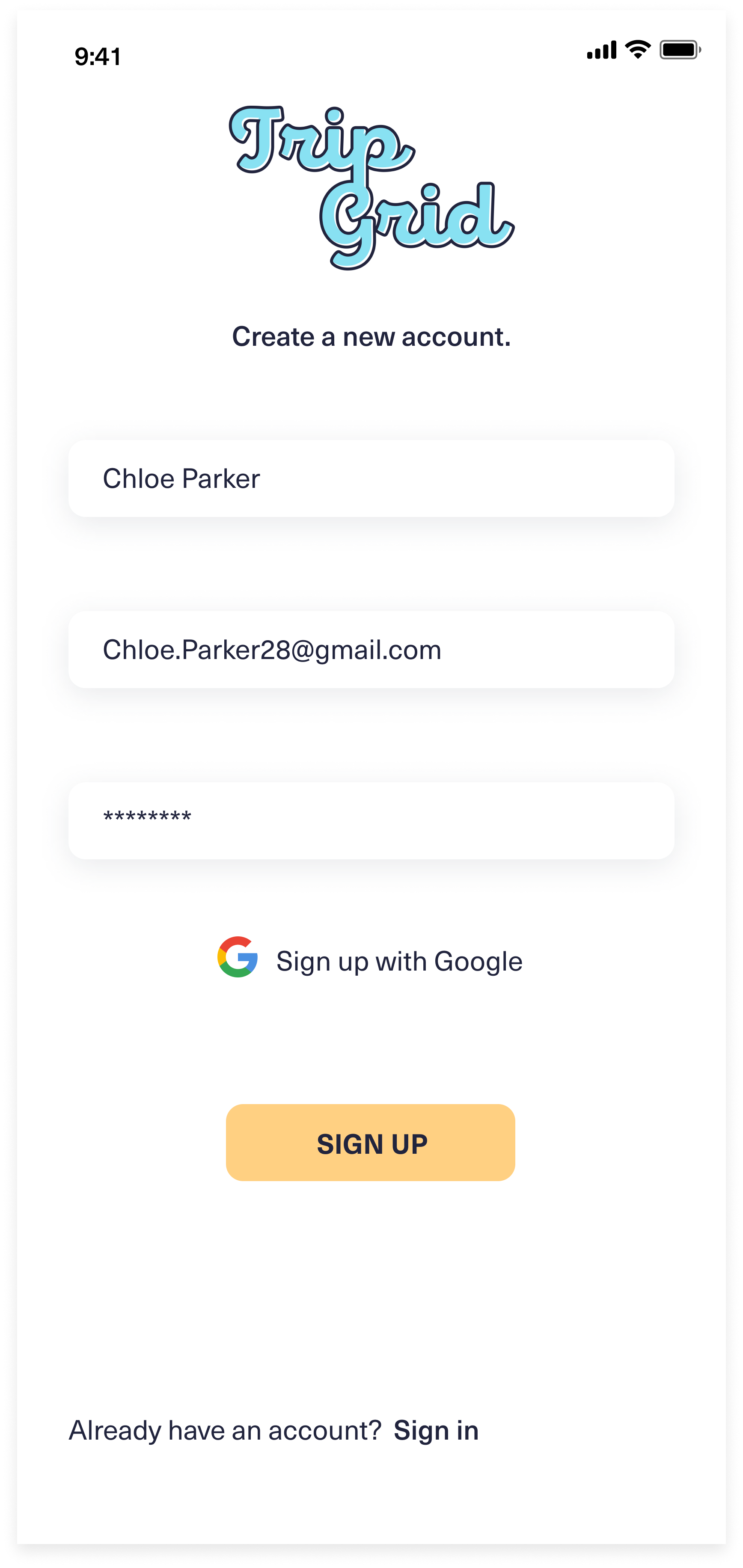
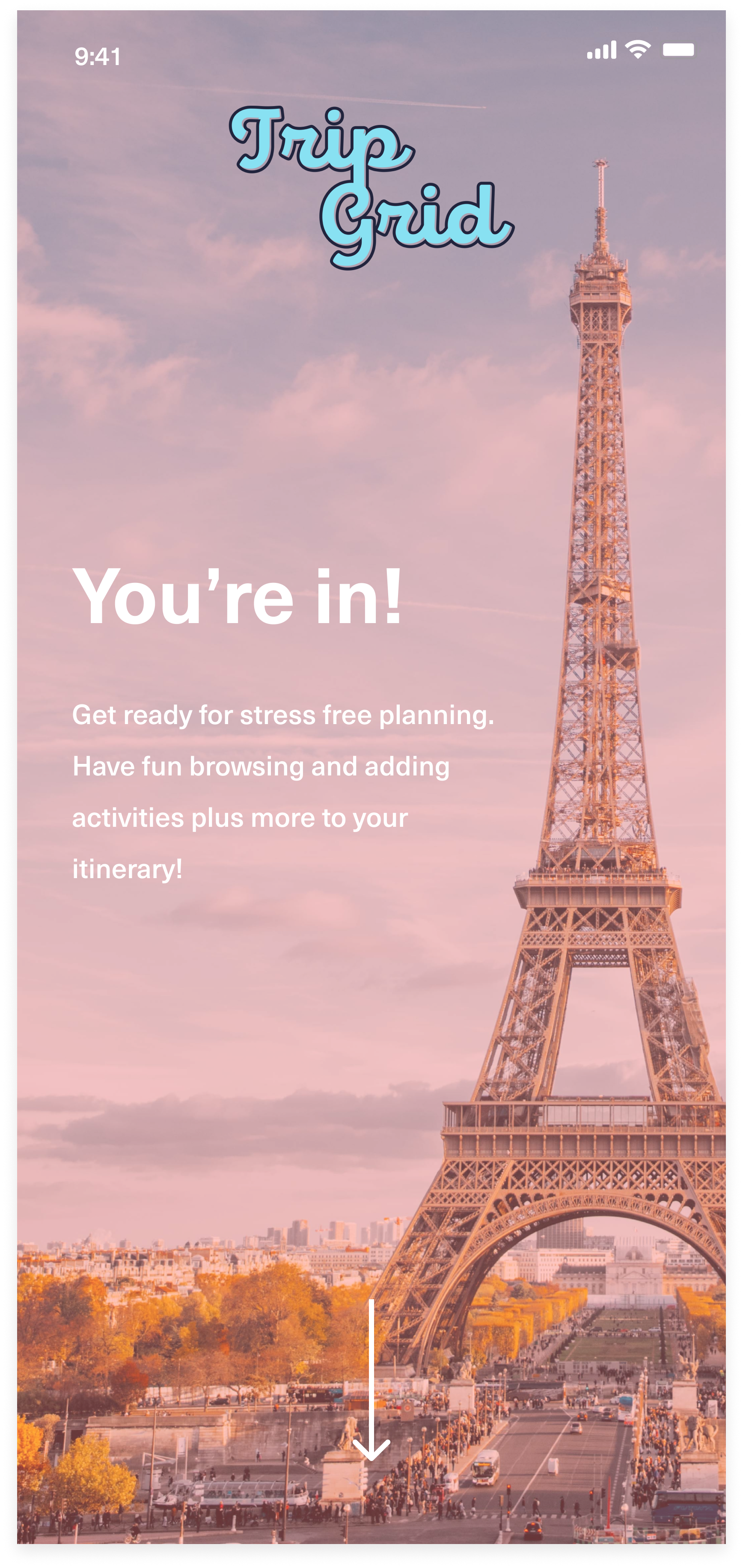
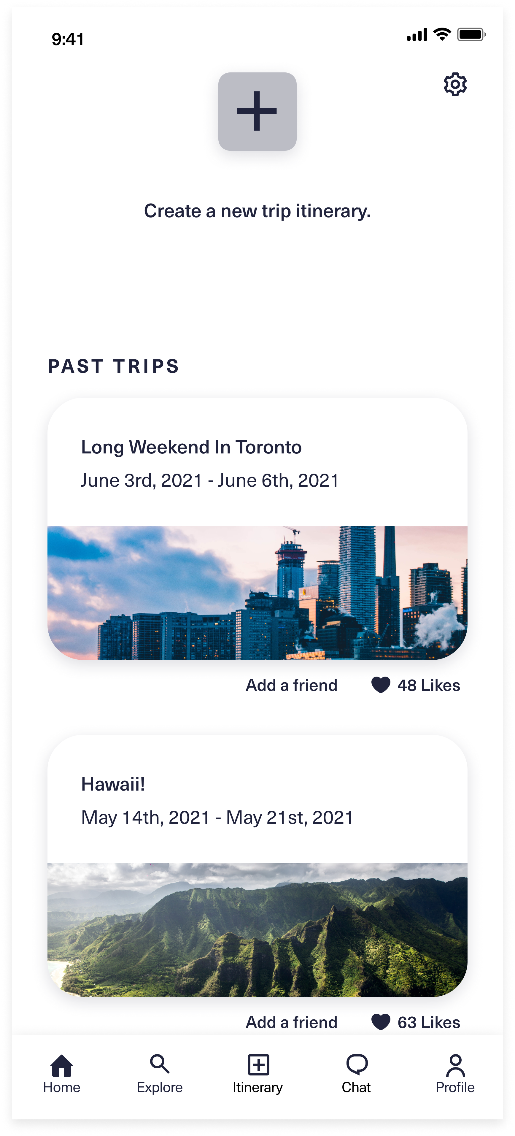
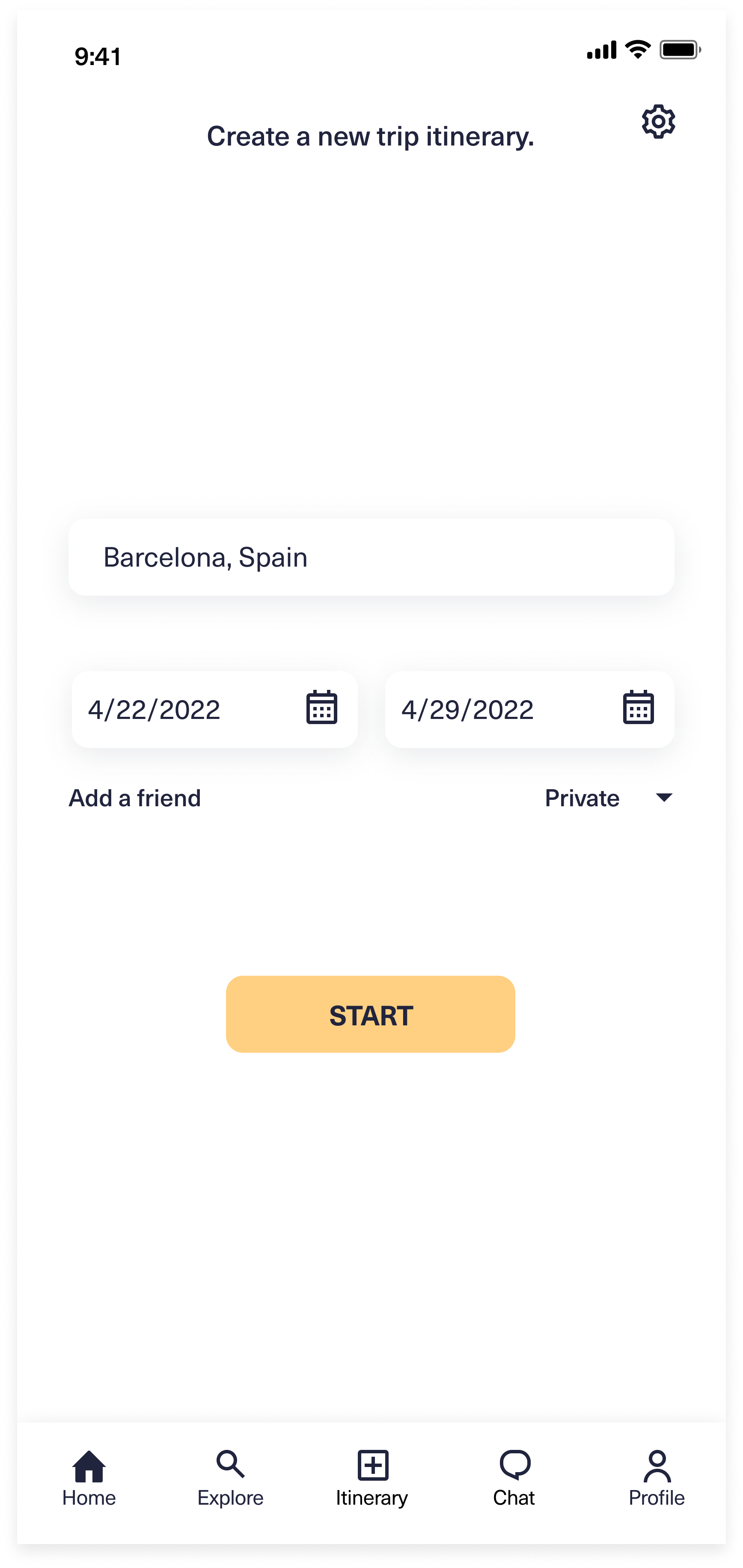
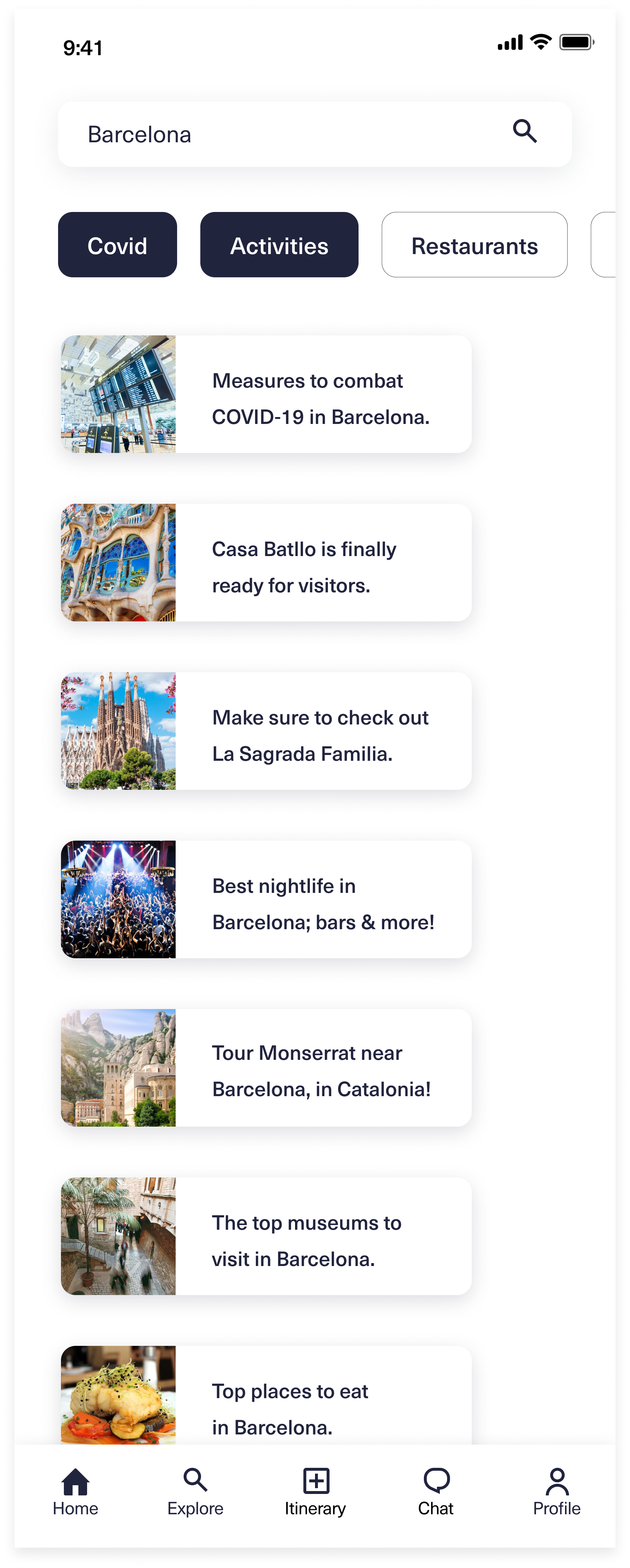
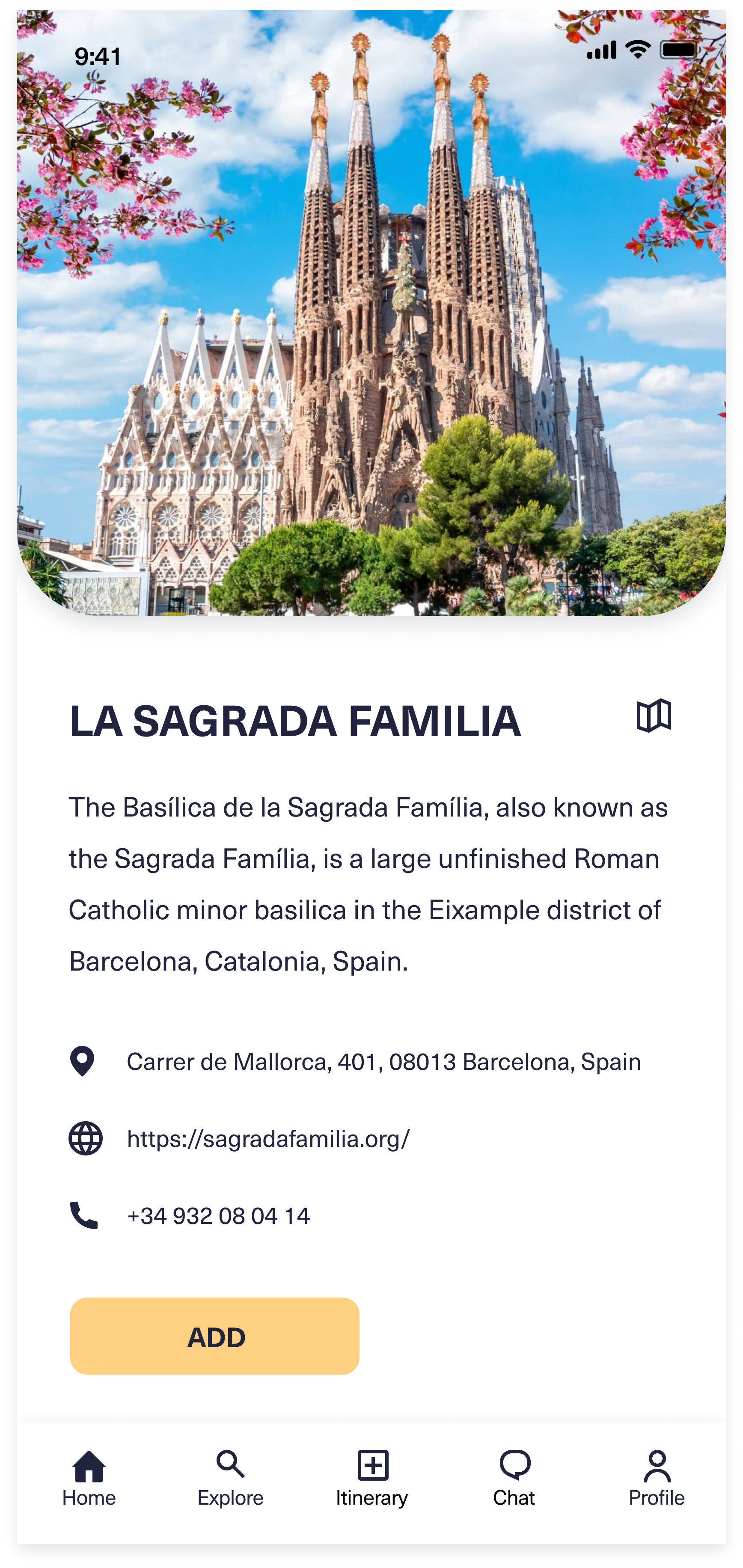
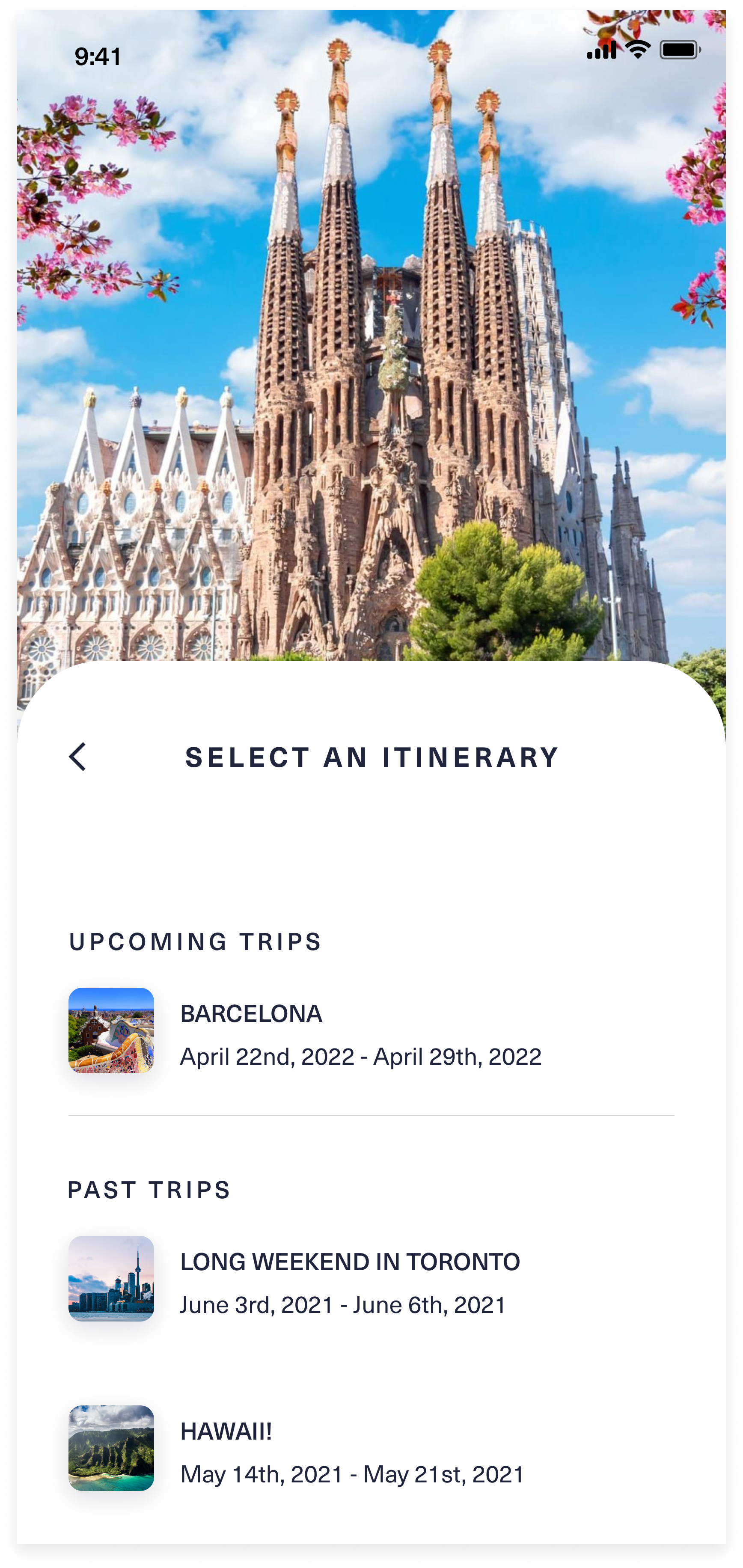
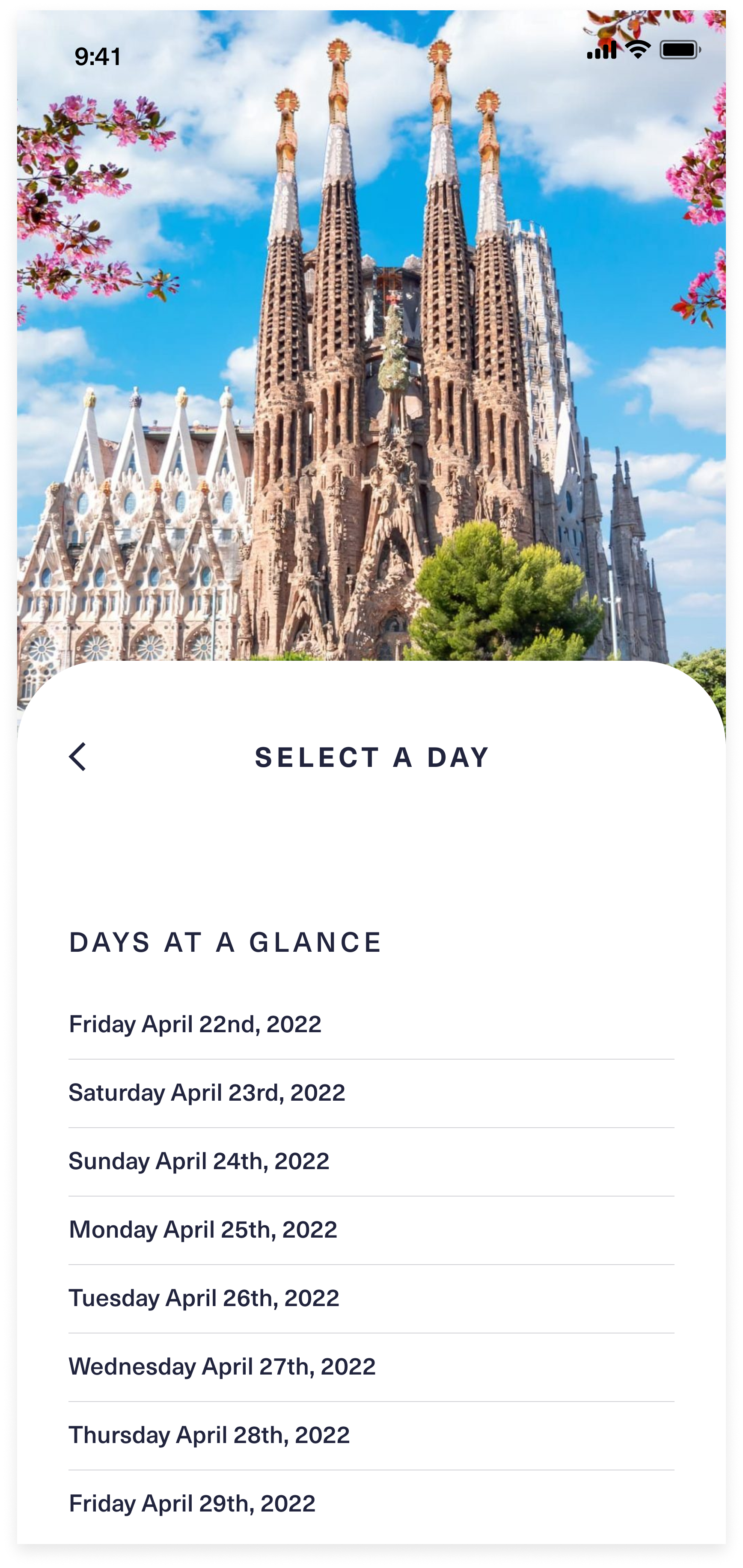
The wireframes have come to life with the guidance of the UI Kit. Now they are prepped and ready for prototyping, then testing later. Here are the original screens below.




HIGH FIDELITY PROTOTYPE
After I built out the UI screens, I created the prototype. I connected a sufficient amount of links for participants to comfortably navigate through the testing phase.
I wanted to focus on 5 main flows (onboarding, creating a new itinerary, adding an activity to your itinerary, navigating to add flight details and navigate to view calendar at a glance while in the itinerary) that will help users to navigate accordingly to build out their itinerary with ease.
Here’s a close look at 2 of the main flows:
Figma Prototype
Affinity Map
After reading through the results and data from my usability test via Maze I developed an affinity map categorizing them by mission.
Insights
After going through the results, I realized the biggest issue was with the navigation throughout some of the flows. My goal is avoid users leaving the app due to frustrations so I followed up with a few iterations to the navigation and design. Overall, despite these few issues, majority of the participants said they would use this app and find it beneficial.
Iterations Based On Feedback
Final Thoughts
At the end of the project, I realized if I had more time I would continue on with iterations; adding to the functionality, integrations, etc to elevate the experience even further. That's the fun of it because throughout the process you force yourself to think outside the box. I had to remind myself that this is supposed to be a Minimum Viable Product and to focus on what brings the most value to the users. Design and tech are always evolving so it’s always good to allow space for future developments.

