Background
Nice started when one of their founders – Robert – had a bad experience getting some small tattoos: one artist refused, one was rude, and another tried to price gouge him. It was in that final unnecessarily expensive moment that he decided there had to be a better way. From this experience, and after recruiting Jes and Jenny to help him start the business, Nice was born! The shop is open to all looking for an alternative to the traditional tattoo parlor environment. Whether you’re the artist or the client, Nice will always be a tattoo parlor where everyone is nice to you.
Project Overview
Since opening in April 2017, in a tiny single-room studio in Carroll Gardens, their little shop has served clients from around the world & surpassed any and all expectations. And while many things have changed, their goal has stayed the same: Create a space where everyone can feel comfortable getting a tattoo, and everyone is nice. The customer experience is what matters most.
The aim is to redesign their website and updated it with a responsive design that enhances their online presence and aligned it with their branding / mission.
The aim is to redesign their website and updated it with a responsive design that enhances their online presence and aligned it with their branding / mission.
High Level Goals
• Redesign or design from scratch a responsive website for Nice Tattoo Parlor.
• Update booking services so customers feel confident with the process of booking an appointment with an artist. Also, make sure all guidelines and protocols are clear and emphasize the importance of them prior to coming in.
• Enhance the branding to make everyone feel welcome; inclusive to all types of people since the shop is currently mostly female oriented.
The Design Thinking Process
I used this design thinking method as a solution based approach to solving the problem.
Research Goals
• Identify how other shops are catering to the online experience and needs of their customers.
• Identify how booking services are structured for different shops.
• Understand customers' whole experience at tattoo shops; from start to finish.
• Understand customers frustrations and experience with online booking services.
• Figure out if customers always book appointments or if they prefer walking in.
METHODOLOGIES
Competitive Analysis
After learning more about the tattoo industry, I wanted to take a closer look at competitor tattoo shops (shown below) and see how they format their sites to cater to the user; tattoo first timers and regulars. I evaluated the strengths and weaknesses of each to see how I fill in any gaps or do things differently.
Some takeaways from the competitive analysis...
Strengths
• Testimonials on the website for user viewing to add to their decision making
• Covid Policy updates given the times we live in now
• Extensive booking form so clients can effectively communicate their ideas and inspirations to their artist
• Wide range of artists with different tattooing styles; bringing in a broader amount of clientele
Weaknesses
• Having just a vague contact page for users to each out; being too exclusive
• Overwhelming website with too much going on ; too clicky
• Not having walk-ins being one of the causes for less foot traffic
• Shops / Artists being too pricey with no skill set to match
• Having just a vague contact page for users to each out; being too exclusive
• Overwhelming website with too much going on ; too clicky
• Not having walk-ins being one of the causes for less foot traffic
• Shops / Artists being too pricey with no skill set to match
User Interviews
Reflections
After talking with my participants I noticed that even though they range from newbie to experienced, their thought processes were not so different. It was interesting to see some views overlap. One participant, who happened to have the most tattoos, said she didn’t really care too much about the atmosphere of the shop or layout of a shop website. She’s gotten tattooed in shops, apartments, garages,etc. What mattered most was the relationship with the artist, their cleanliness and experience. Below I’ve added a few more insights from my interviews.
User Persona
I took the important details from the interview phase and translated it into an empathy map showcased below.
With that as a guide, I developed a user persona, Jean Cohen, for Nice Tattoo. She is a representation of their key audience. I highlighted the personas needs, frustrations while understanding the type of person she is.
Problem Statement and HMW Questions
To help better define the problem, I created an applicable problem statement that embodies the knowledge I gained about the users and key insights from the empathy phase.
With that , I then generated a few HMW questions to allow room for ideation to create specific solutions.
With that , I then generated a few HMW questions to allow room for ideation to create specific solutions.
Statement
When Jean needs to plan out her next tattoo sessions, she books about a month in advance because she needs to fit it in between her shooting schedule.
PROJECT GOALS
After a bit of brainstorming, I mapped out the project goals. This served as a guide for future development of the product and how to enhance the customer experience.
I also created a list of product features to make a thorough road map.
I also created a list of product features to make a thorough road map.
View the road map here.
Site Map
Focusing on insights and using the roadmap created as a guide, I built out a site map to help define the overall structure of the Nice Tattoo website.
Task / User Flows
Once a site structure was put in place, I thought about how the user, Jean, would engage with specific screens to complete the task of booking an appointment in the most simplified way.
I then expanded the user flow into two scenarios to showcase the paths Jean takes in her decision to book an appointment. The user flow explains her journey and thought process.
View them closer here.
Sketches
When starting the sketching phase, I wanted to bring the focus to a few CTA’s that would capture the customers attention on the homepage and focus on enhancing the screens identified in the user flows. Below are a few of my homepage ideations.
Lo-Fi Wireframes
Based on the final sketches, I created lo-fi wireframes.
Before working on the other screens, I laid out the responsive screens for the homepage and added key annotations along the way. Then I built out the screens needed to fulfill the tasks related to the usability test later.
Before working on the other screens, I laid out the responsive screens for the homepage and added key annotations along the way. Then I built out the screens needed to fulfill the tasks related to the usability test later.
Mood Board and Style Tile
When designing the mood board, I kept a few keywords in mind - inviting, vibrant, calm, accessible. I wanted to stay true to what their brand mission is: A tattoo shop where everyone is nice to you.
Upon completing the mood board, I developed their style tile keeping the same mindset. I decided to leave their logo as is because it’s clean and enough of a statement. I added a few submark selections to go with the one they had. I also incorporated some vibrant imagery that will be used within the shop as well as final color palette and font choice.
UI Kit
As the website was coming to life with the guide of the style tile, I built out a compilation of UI elements, components, that would exist on the site as well. These elements also serve as a reference for future design iterations. This kit was created as a guide for designers and the developers.
Other Main Screens

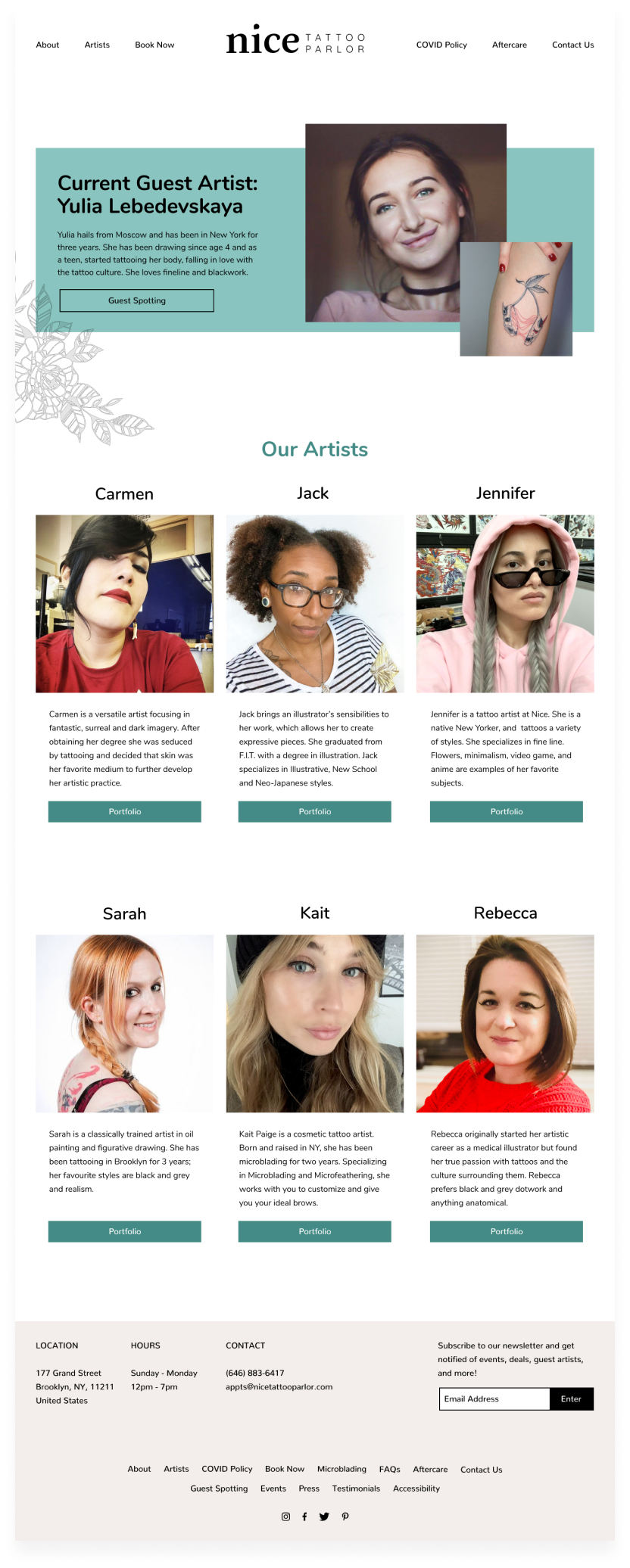
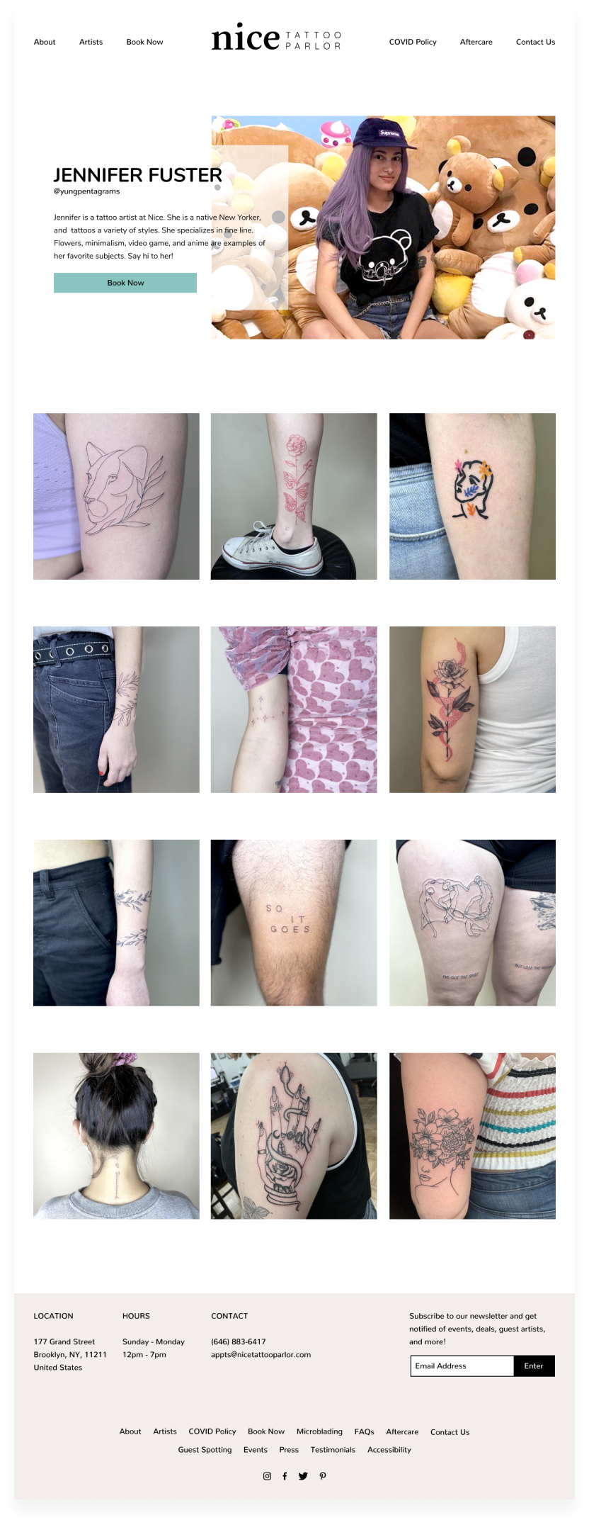
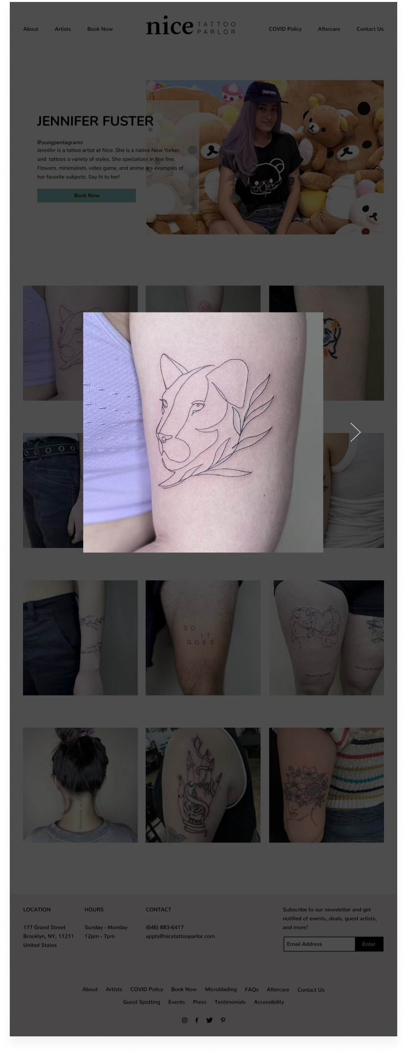
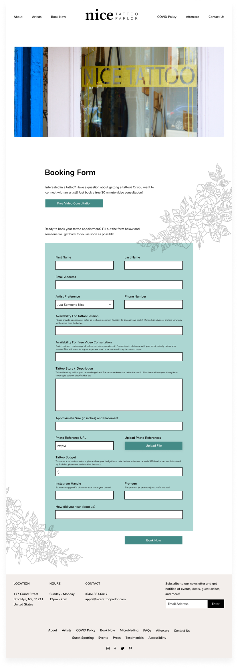
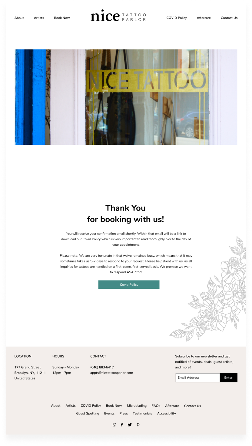

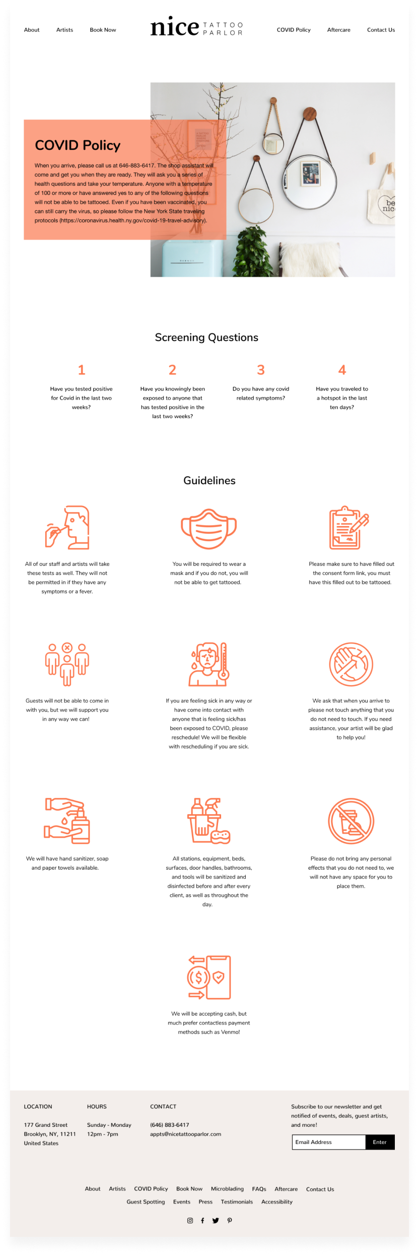
High Fidelity Prototype
After building out all the necessary UI screens, I created this prototype. I connected a sufficient amount of links and created interactive components with variants for participants in the testing phase.
I wanted to focus on the end goal which was for participants to successfully book a tattoo appointment.
I wanted to focus on the end goal which was for participants to successfully book a tattoo appointment.
Usability Testing
I conducted in-person and virtual tests, via zoom, and participants shared their screens with me and spoke their thoughts out loud as they performed the scenario - Navigating and exploring the website with the goal of booking an appointment with one of the artists. Afterwards, I asked a few follow up questions about their experience. You can view the full test plan here.
Figma Prototype
Affinity Map
I created an affinity map to find patterns, frustrations, and insights when users were interacting with the prototype. I listed common themes (booking, navigation, aesthetic) that were shared by participants during and after the testing phase.
After usability testing, overall participants were able to comfortably navigate the site and perform the task to completion with little setbacks. With that said, there are definitely areas for improvement.
Ideations Based On Feedback
Final Thoughts
I will continue making iterations on this case study based on some of the feedback I received. While working on this project it had me thinking, especially in covid times, it would be beneficial to step it up a notch and create and app for the shop that would allow users to somehow “try on” the tattoo vector design via an AR feature. They’d be able to virtually interact closer with the artist and work out sizing, placement etc. prior. That would definitely be interesting to see and test out as next steps in user experience.

