Background
Mirror started back in 1994 as a clothing store targeting an audience looking for cheap clothing for any occasion. The quality is pretty good and the prices rather low. Their main ideal is to make any type of clothing accessible to everyone. They believe clothing doesn’t have to be expensive and last forever, that we should be able to change styles as we need and please. Mirror is very successful offline with over 400 stores around the world in 32 countries. They are very late in the game for a digital transformation. They decided a few years back to not invest in digital because they prefered keeping the service in person. However, the opportunity for sales is huge online, and the behavior is rapidly mainstreaming. Now is the time for them to transition into the digital space, cater to even more customers with different styles and provide them with a space where they can shop with ease.
Project Overview
Mirror is a global chain with clothing for everyone. They also have different styles (casual, business, sport, party, formal, etc.) They want to take their business online since currently they only have a very outdated information website with only locations, promotions, and a bit of background about the company. For now, they want to start with a new logo and an ecommerce responsive website where they can sell their products online. They want it to be very good with filters, particularly being able to select the size, so their customers can perform that task online with ease.
High Level Goals
• Redesign Mirror’s logo and identity; keeping it modern, fresh and neutral enough to attract all types of people and their styles.
• Design a responsive, user friendly e-commerce website that reflects the Mirror brand identity and helps them expand their sales while addressing customer needs.
• Design a responsive, user friendly e-commerce website that reflects the Mirror brand identity and helps them expand their sales while addressing customer needs.
The Design Process
I used this design thinking method as as solution based approach to solving the problem and catering to the customers needs.
Research Goals
• Understand what makes an online retail site popular leading them to achieve a high volume of returning customers.
• What qualities a retail site needs to allow customers to have a positive, successful shopping experience.
• Understand what’s important to users when shopping and what kind of experience users are looking to have when shopping.
• Understand the pain points of online shopping.
• What qualities a retail site needs to allow customers to have a positive, successful shopping experience.
• Understand what’s important to users when shopping and what kind of experience users are looking to have when shopping.
• Understand the pain points of online shopping.
METHODOLOGIES
Competitive Analysis
After learning more about the online retail industry, I wanted to take a closer look at competitors (shown below) and see how they format their sites to cater to the customer. I evaluated the main strengths and weaknesses of each to see how I fill in any gaps or do things differently.
Strengths
• Alternative payment options like Afterpay; buy more and pay it off in 4 installments!
• One stop shop for your wardrobe; clothes for every occasion, shoes, accessories, etc.
• One stop shop for your wardrobe; clothes for every occasion, shoes, accessories, etc.
Weaknesses
• Filters not being up to par; either too cluttered or not enough to customize a search.
• Customer reviews being a no show! Not being able to read other customers opinions on the product takes away from the shopping experience.
• Customer reviews being a no show! Not being able to read other customers opinions on the product takes away from the shopping experience.
User Interviews
I conducted user interviews to understand the user's pain points, needs and motivations during their online shopping experience.
“Why are standard shipping fees so high?!”
Overall
I realized, for the most part, online shopping is a necessity. Is it a preferred option?…not an overwhelming amount, surprisingly. After talking with the interviewees, some things I noticed are that they love the convenience of online shopping, 4 out of 5 of them are shopping for themselves and other people...kids majority of the time, and they are loosely repeat customers; not 100% loyal to one store.
For Mirror, they need to achieve brand loyalty. Shoppers don’t want to break the bank. They want to shop for their needs of course, but shouldn’t feel buyers remorse when shopping for things they want. It should be an enjoyable experience. A little incentive, from retailers, goes a long way.
For Mirror, they need to achieve brand loyalty. Shoppers don’t want to break the bank. They want to shop for their needs of course, but shouldn’t feel buyers remorse when shopping for things they want. It should be an enjoyable experience. A little incentive, from retailers, goes a long way.
User Persona
I used findings from the interviews and empathy research to develop the Mirror user persona. We highlight the personas needs, frustrations while understanding the type of shopper she is.
Problem Statement and HMW Questions
To help better define the problem, I created an applicable problem statement that embodies the knowledge I gained about the users and key insights from the empathy phase.
With that , I then generated a few HMW questions to allow room for ideation to create specific solutions.
With that , I then generated a few HMW questions to allow room for ideation to create specific solutions.
Statement
Bailey needs to keep her wardrobe up to date but it’s difficult to find everything her closet needs without breaking the bank.
View the road map here.
Site Map
In order to guide the information architecture of the site, I ran a remote open card sorting exercise to gain insights on how users naturally organize content. I asked the participants to sort a deck of 30 cards in a way that made the most sense to them.
Now that I’ve gained some knowledge of how they may organize the content, I was able to develop a site map to help visualize the IA and see how each screen connects.
Now that I’ve gained some knowledge of how they may organize the content, I was able to develop a site map to help visualize the IA and see how each screen connects.
Task / User Flows
Once the app map was build, I thought about how the user would engage with specific screens to complete the simple task flow of purchasing a women’s black coat.
I then expanded that for the user flow and showcased the 2 different flows Bailey took to buy that same black coat with a few decisions along the way.
You can take a closer look at the flows here.
I then expanded that for the user flow and showcased the 2 different flows Bailey took to buy that same black coat with a few decisions along the way.
You can take a closer look at the flows here.
Responsive Homepage Lo-Fi Wireframes
During the sketch phase, I went with a more structured layout for the Mirror site. Kept the design minimal and gave it a blog like aesthetic; highlighting products with clear CTA’s, important features like Home Try On, the newsletter, sales and more. Then using the sketches, I built out the lo - fi responsive homepage wireframes for tablet and mobile.
While developing the remaining lo-fi wireframes needed to fulfill the tasks associated with the usability testing, I made sure to add annotations along the way.
Close look at one of the main screens
With annotations below.
Mood Board
When it came to the branding, I wanted to put together a simple mood board to convey the aesthetic of Mirror. With that in mind, I stuck with a few key words throughout the process - neutral, minimalistic, calm, elevated, modern. I kept the same thought process with the logo design.
Logo Design
From sketches to final design, I worked to align the selections with the key words from the mood board. It began with trying to emulate a mirror but decided to lean towards a more structured, modern, and clean direction.
Brand Style Tile and UI Kit
Inspired by the aesthetic of the mood board, logo design and thought process behind the wireframes; the style tile came to life. Minimalistic and elevated.
As we get further into the visual design, the UI Kit continues to grow with components and patterns that make up the Mirror website. These elements also serve as a reference for future design iterations.
As we get further into the visual design, the UI Kit continues to grow with components and patterns that make up the Mirror website. These elements also serve as a reference for future design iterations.
UI Responsive Wireframes
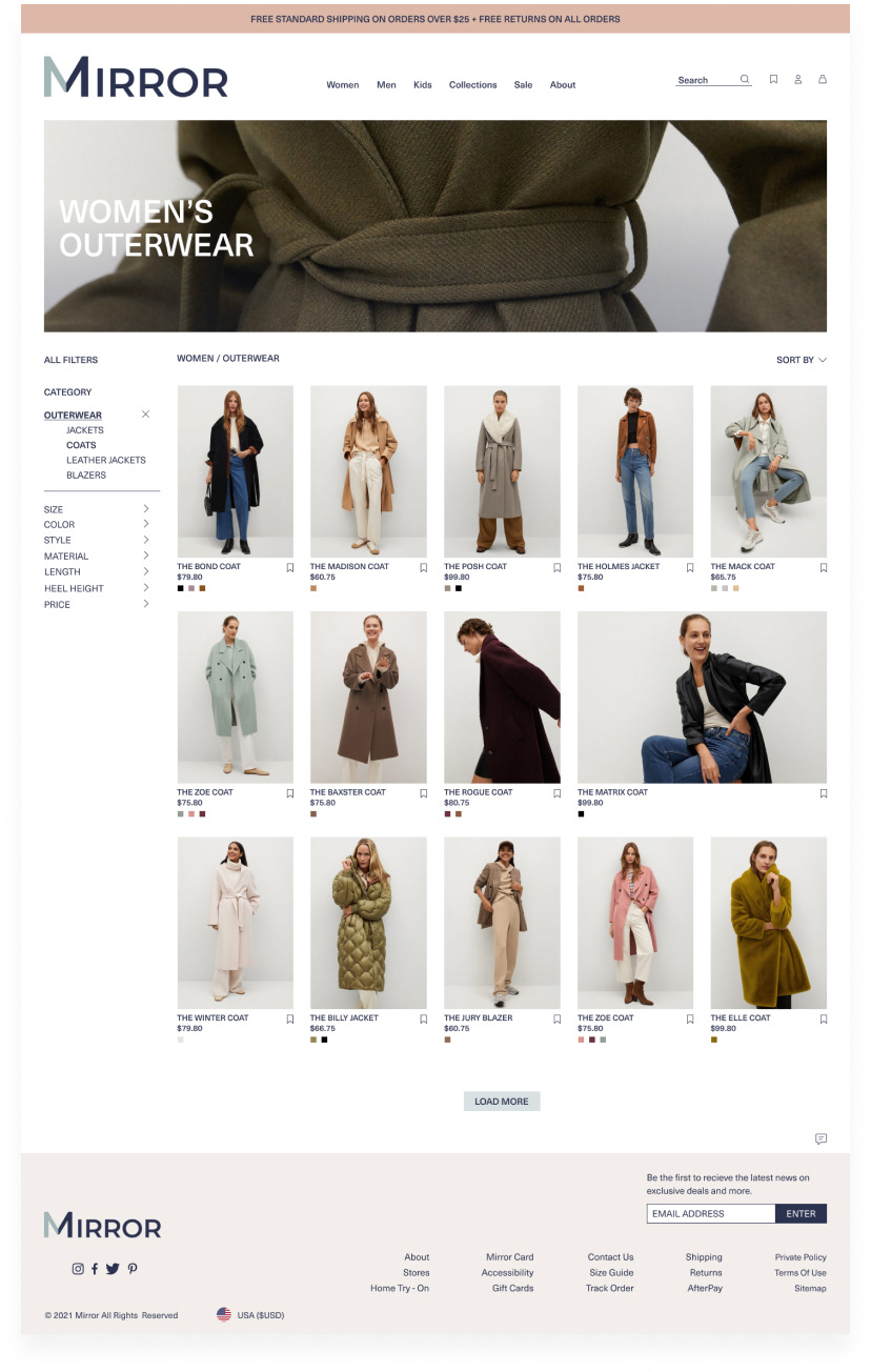
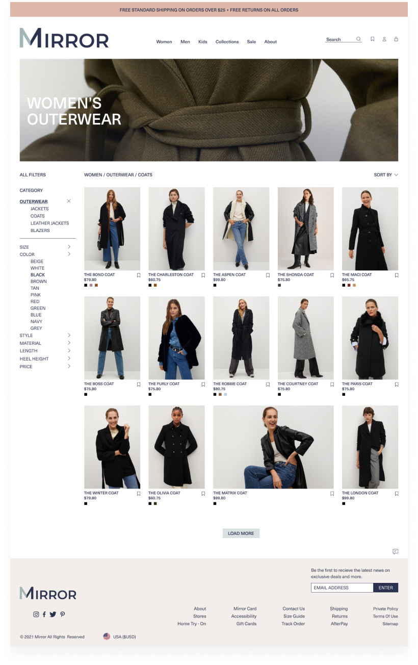
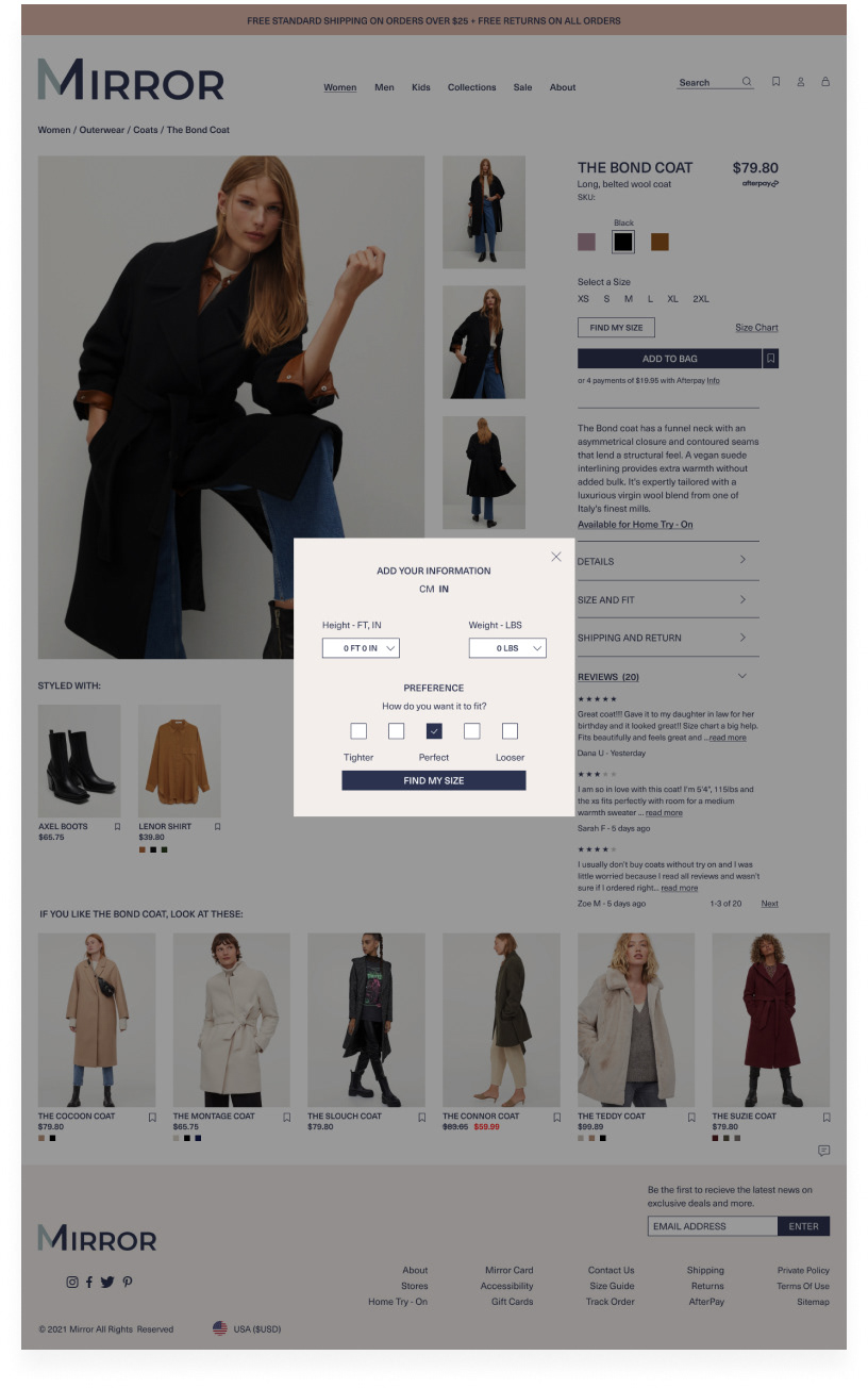
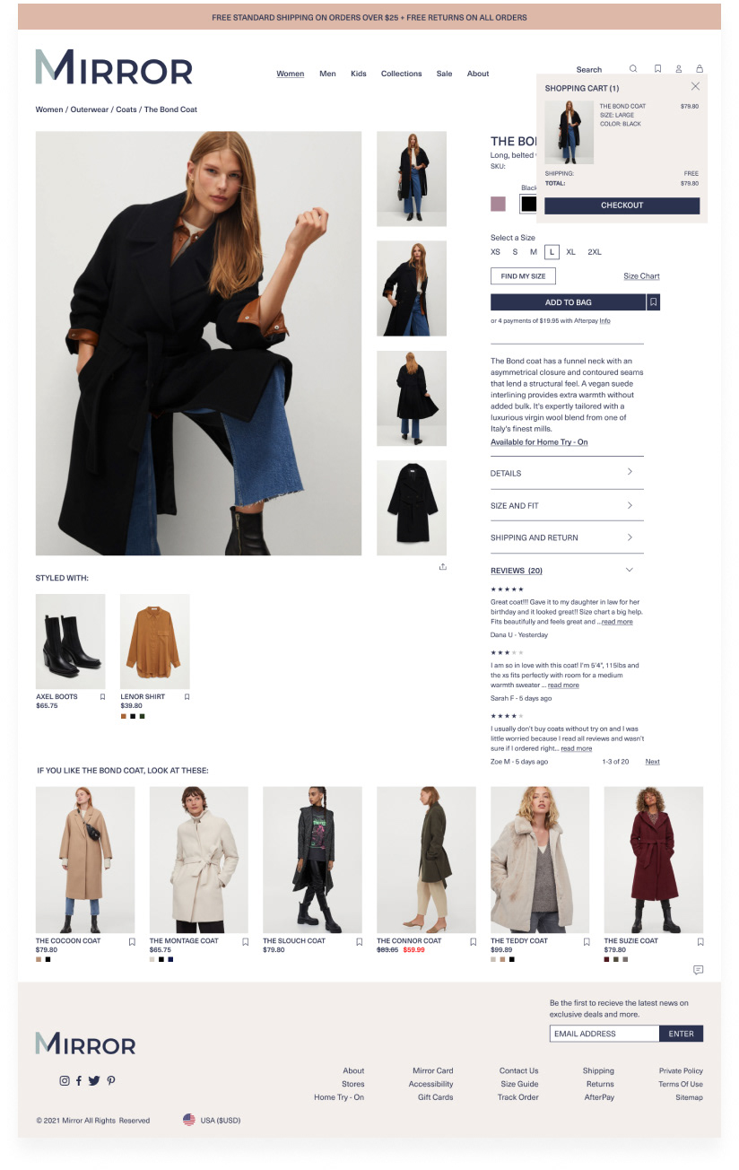
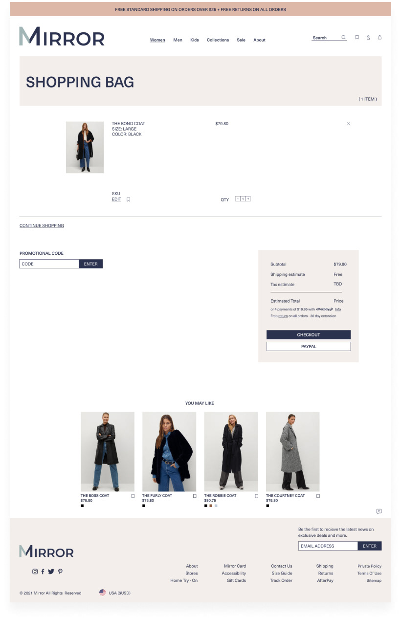
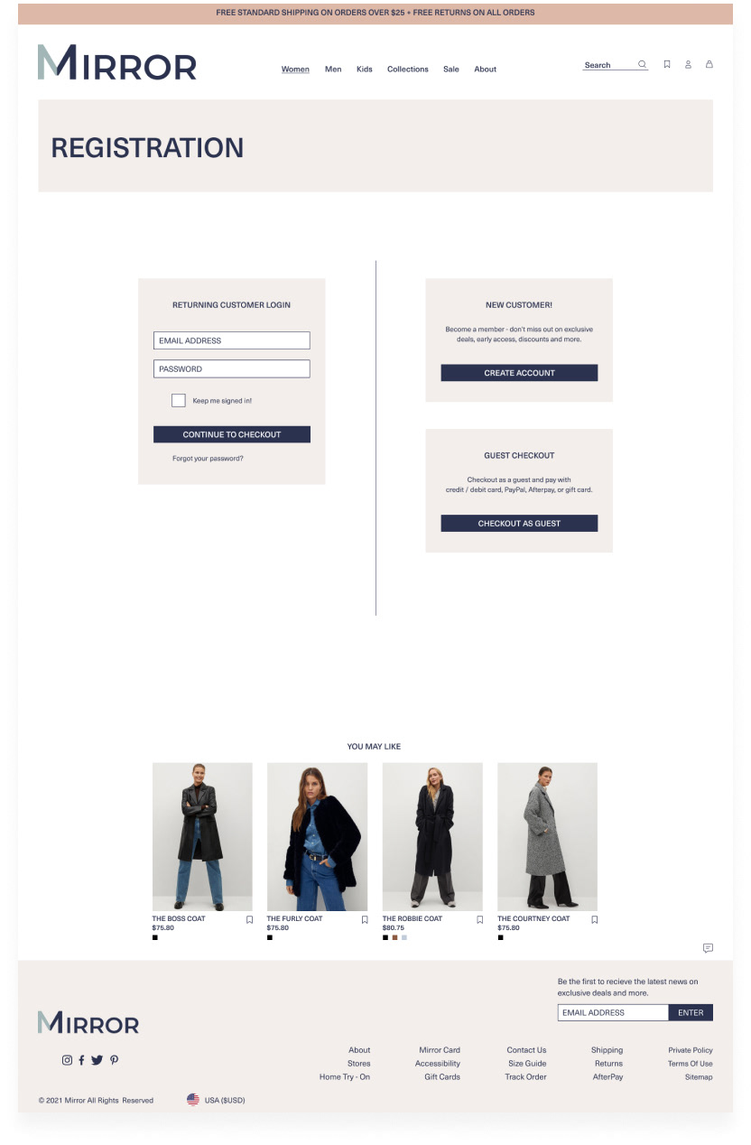
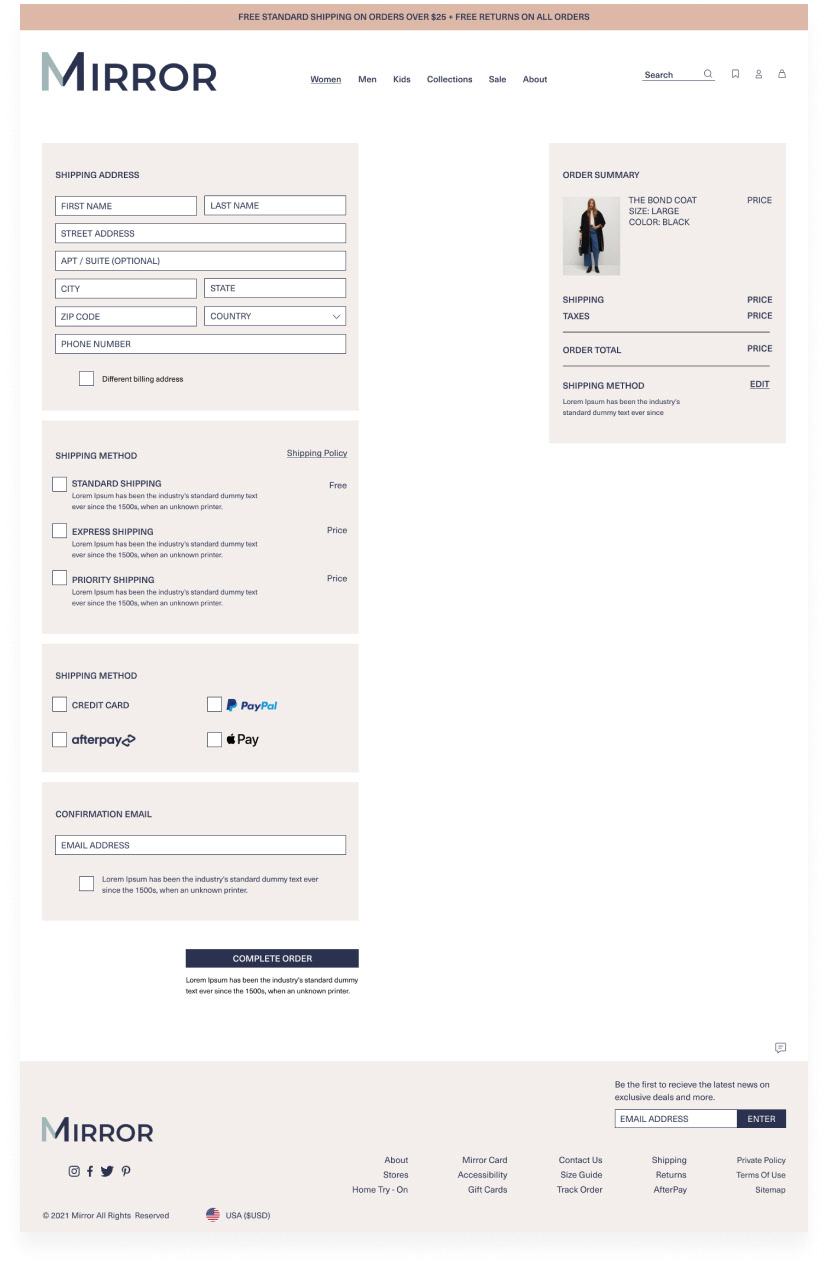
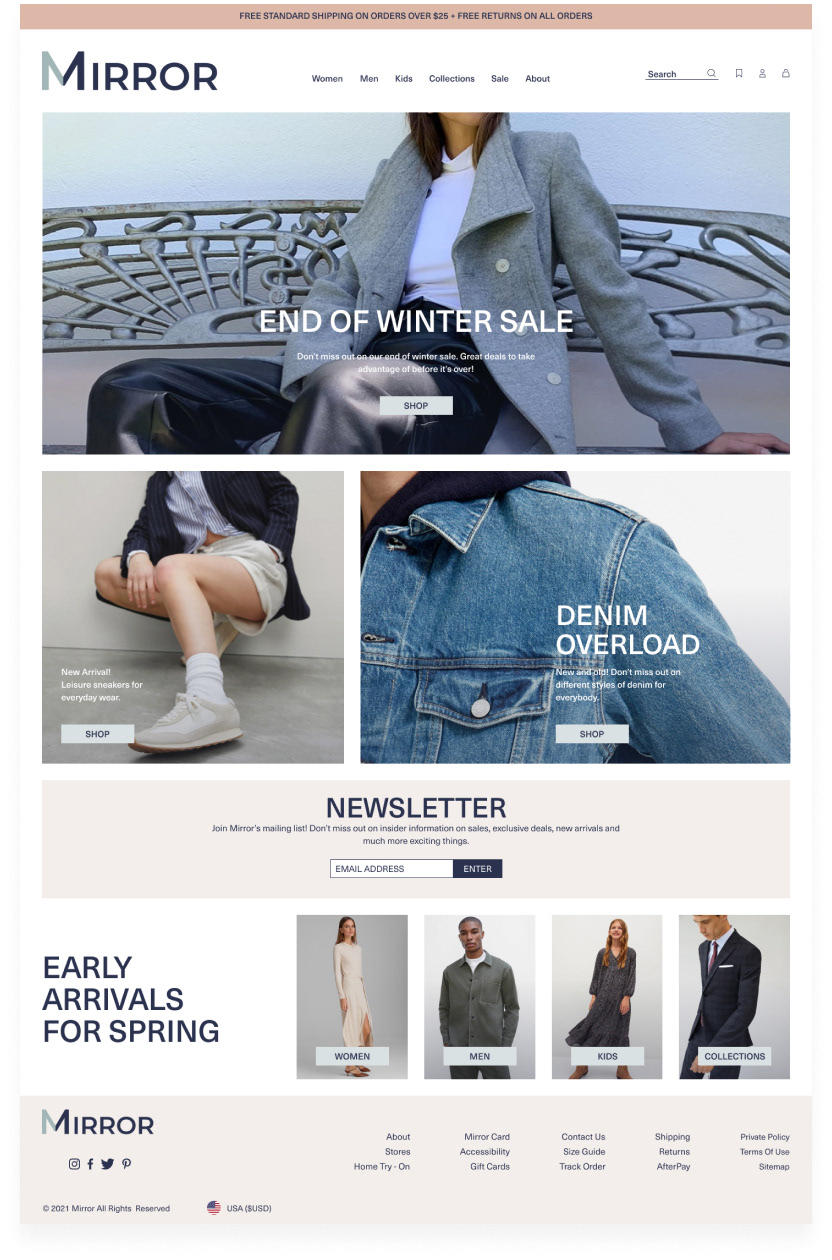
Using the mood board and ui kit, the ui design started to take form. So, I worked on the responsive home and main flow page designs first and then worked on the others.
The Other Main Screens
High Fidelity Prototype
After building out all the necessary UI screens, I created this prototype. I connected a sufficient amount of links and created interactive components with variants for participants in the testing phase.
I wanted to focus on the end goal which was for participants to navigate the site and purchase a black coat (simplified version shown below).
Usability Testing
I conducted in-person and virtual tests, via zoom, and participants shared their screens with me and spoke their thoughts out loud as they performed the scenario - Navigating throughout the new retail website, browse their range of black coats, select one and go through their processes of adding to cart and with the goal of proceeding to checkout. Afterwards, I asked a few follow up questions about their experience. You can view the testing plan here.
Figma Prototype
Affinity Map
I created an affinity map to find patterns, frustrations, and insights when users were interacting with the prototype. I listed common themes (first impressions, navigation, category page, product page, checkout) that were shared by participants during and after the testing phase.
After usability testing, overall participants were able to comfortably navigate the site and perform the task to completion with little setbacks. With that said, there are definitely areas for improvement.
Iterations Based On Feedback
Final Thoughts
Throughout this process I learned that iterations are truly endless. But with every iteration comes more knowledge and new techniques learned. One challenge I came across was recruiting people for interviewing and testing. In the future I will use my network more and reach out to a wider group of individuals via slack channels and social media. This can also be beneficial for me in terms of networking.
In the future I would also create components from the start and keep elements cohesive. Although it took quite some time, I did really enjoy designing the UI wireframes. It was nice to see everything come to life.
In the future I would also create components from the start and keep elements cohesive. Although it took quite some time, I did really enjoy designing the UI wireframes. It was nice to see everything come to life.

