PROJECT OVERVIEW
FlexIt is a wellness platform focused on making fitness, health and nutrition accessible to everyone. It allows users to book and train with personal experts, live 1-on-1, from their laptops, tablets and phones. Since the launch in 2019, the user dashboard has been the same layout with little to know updates; a space to join sessions, check session history, and with other features that were often looked over. The aim was to give it a responsive redesign to align better with where the brand is currently and accommodate the growing user base.
PROBLEM STATEMENT
The FlexIt user account platform is mainly where clients would join their live training sessions and check plan/billing status. Majority of clients would drop off the platform after their sessions and not utilizing the features the platform has to offer for account holders.
.
.
PROJECT GOALS
• A responsive redesign for the structure of the user account to be easy to navigate, be more interactive and functional starting with the main dashboard.
• Update the user account to be cohesive with the refreshed company branding.
• Utilize the dashboard to promote FlexIt product updates and new features.
project scope
We used this process as a solution based approach to solving the problem.
We did a bit of Competitor analysis (peloton, nike) taking a look at the structure of their dashboards, what they deem as important for the users at first glance, how are they catering to their clients individually, and what's possibly enticing the clients to come back and utilize the platforms further.
SOME TAKEAWAYS...
Peloton
• Smooth / clear navigation
• Smooth / clear navigation
• Minimalistic layout of features
• The design is very intuitive
• Information is easily scannable
WHAT WE WERE WORKING WITH...
Previous (User Account) Dashboard
• The first screen is for new users. Once their account is created, users are led to their dashboard. Here, they'd find a banner introducing them to Virtual Personal Training (VPT). Also, they'll have the ability to search potential trainers/nutritionists/RD's.
• The second screen is for the long term user. Here they able to view their train plan(s), upcoming sessions, trainers they've trained with already as well as the opportunity to browse new ones.
We came together to have a discussion and produce some solutions for the redesign.
After brainstorming, I created some rough sketches. I wanted to focus on the key insights from our research phase while keeping our project goals in mind; more interactive, functional and easy to navigate, a way to promote updates and introduce new features.
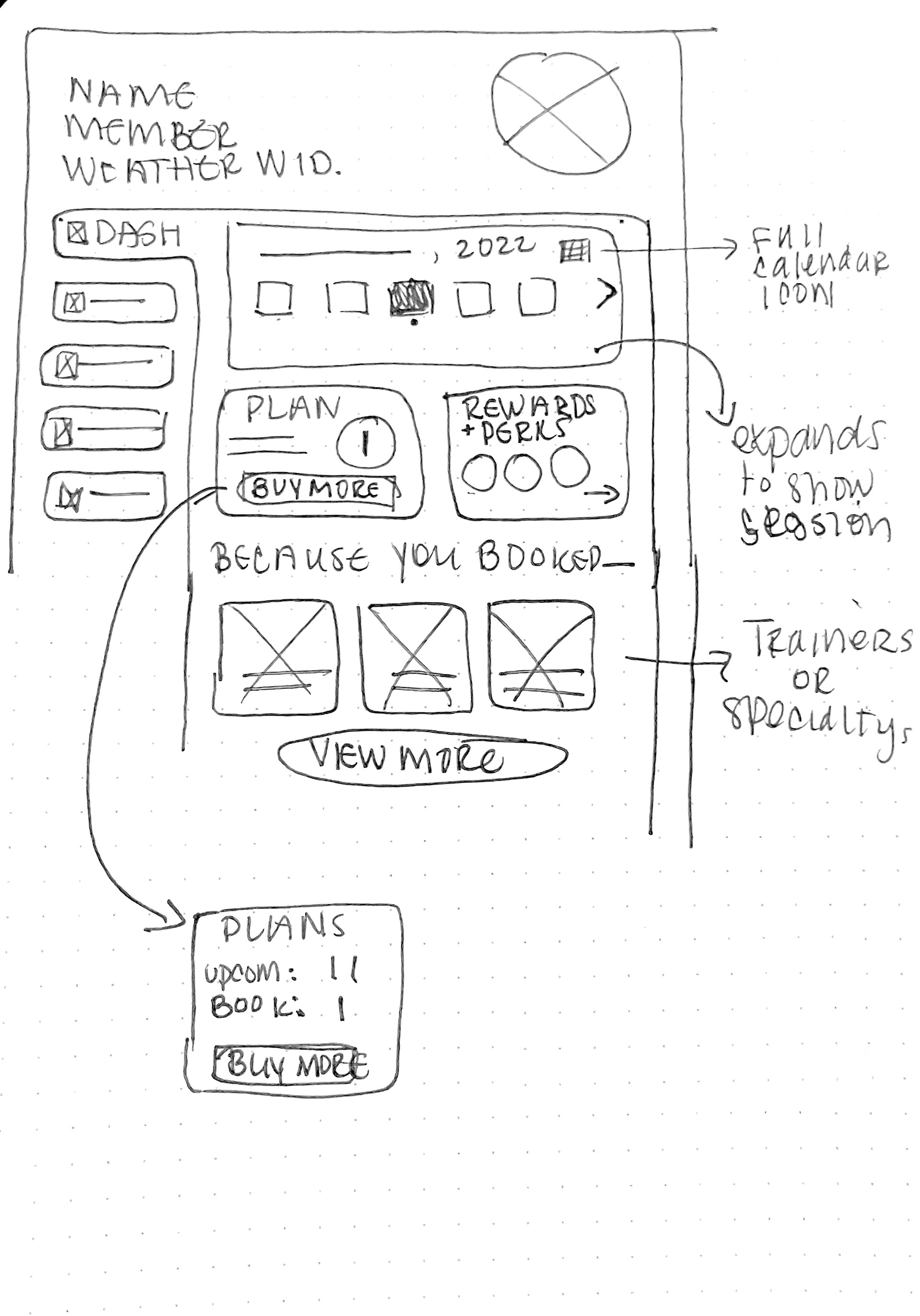
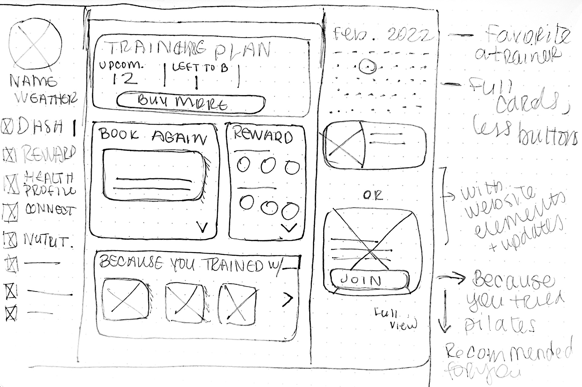
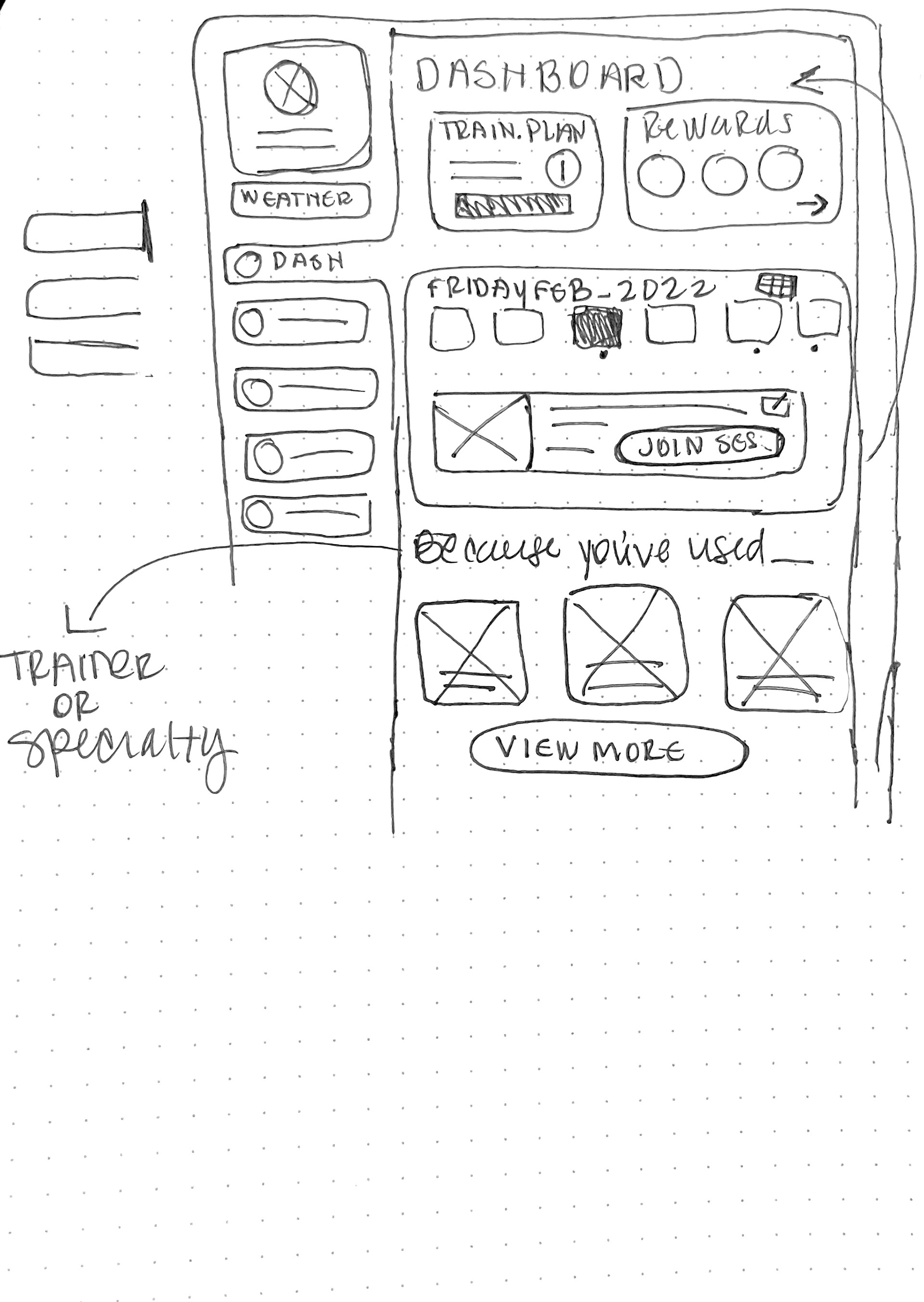
Low fidelity wireframes
After sketching out a few options and figuring out what should be showcased, we decided having widgets on the dashboard would be the best way to house the information that was necessary while still remaining organized.
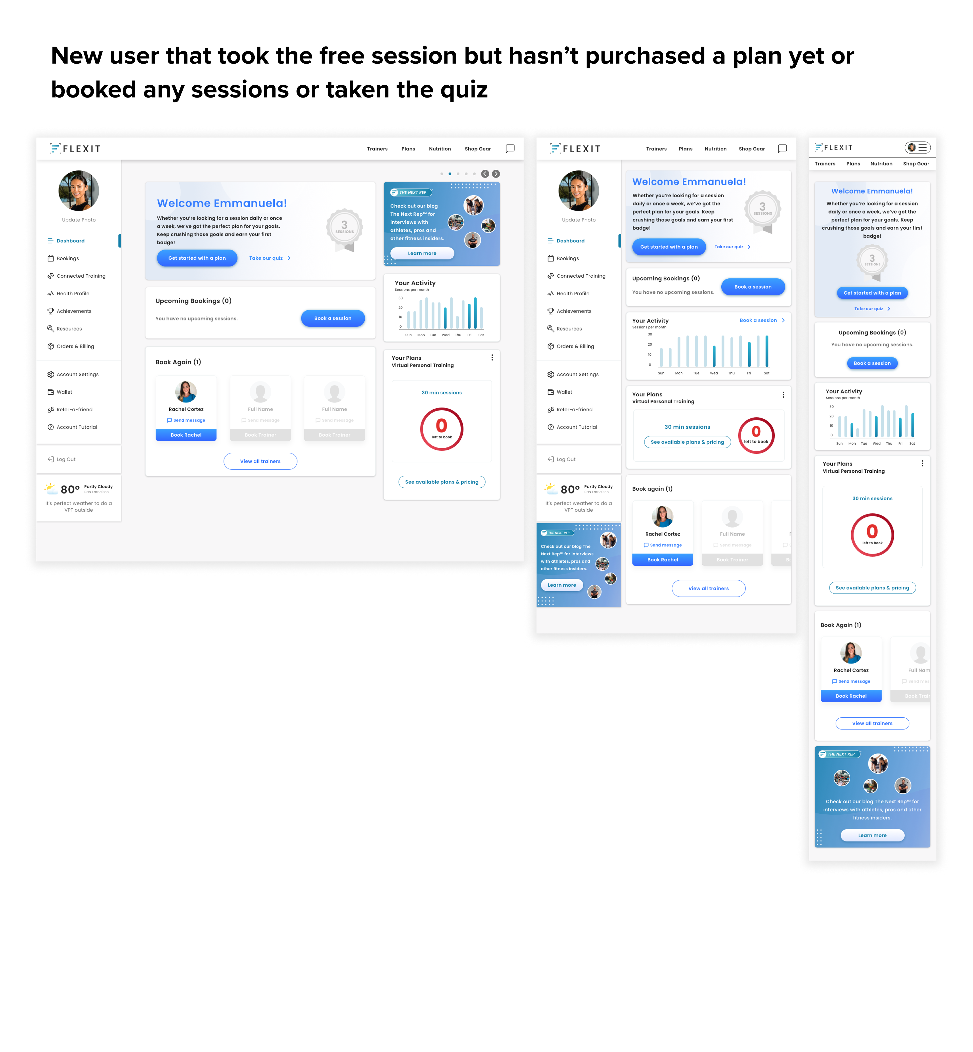
Once we set a clear visual hierarchy, we began bringing our wireframes to life. I designed different responsive screens which catered to specific users…new user, fitness focused user or nutrition focused user.
RESPONSIVE HIGH FIDELITY WIREFRAMES
A close look with annotations
Other responsive dashboard screens that catered to specific users.
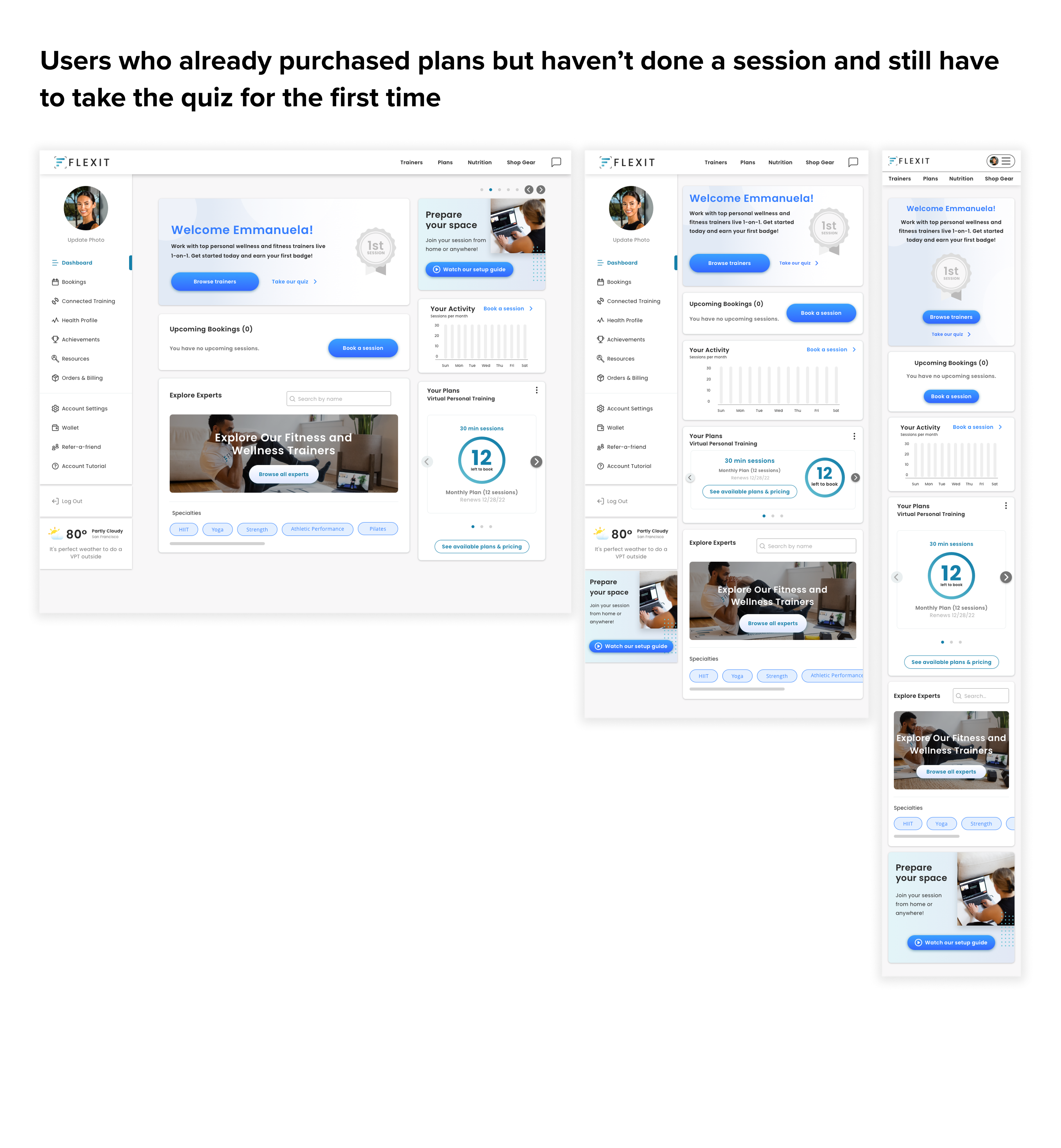
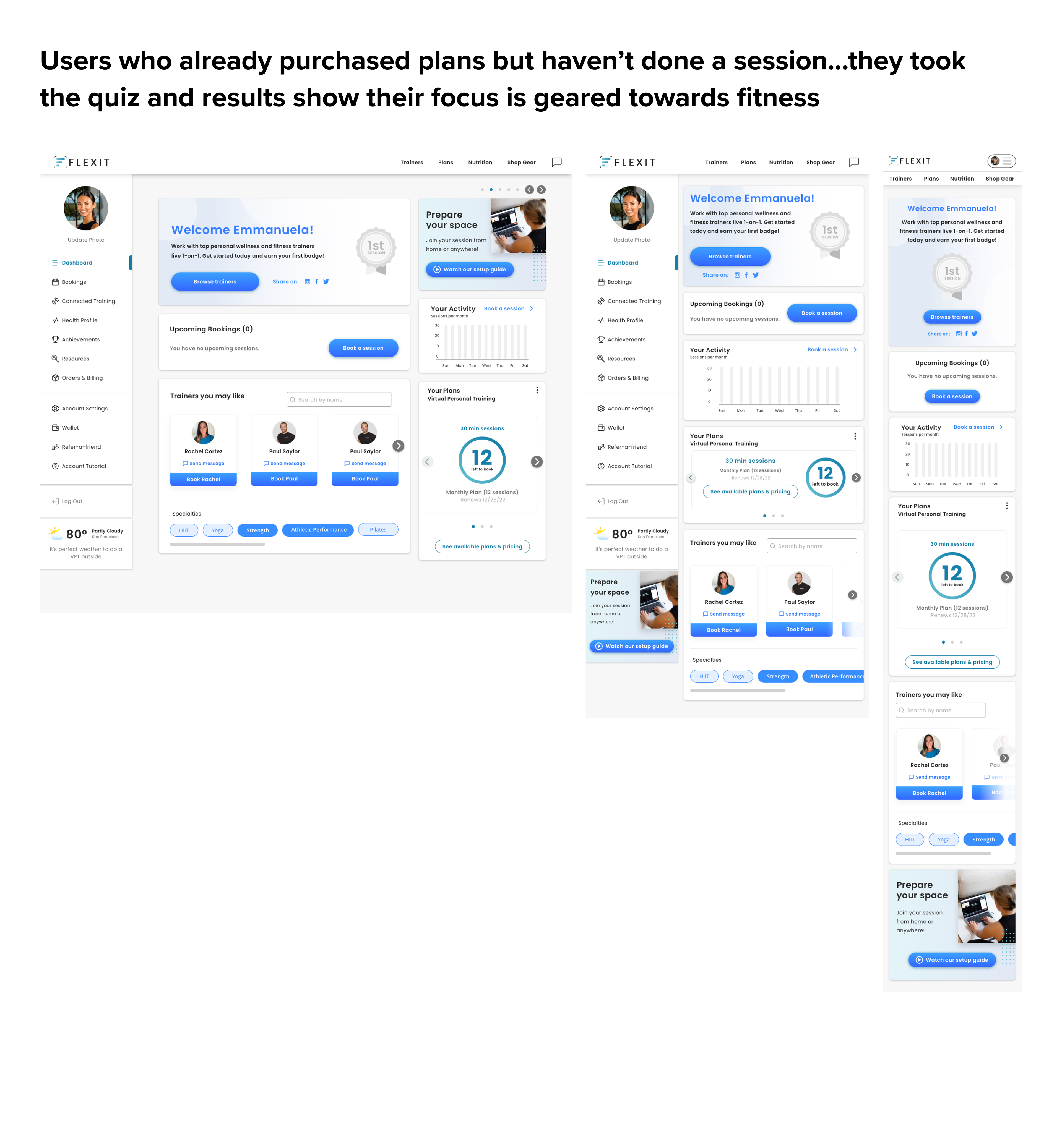
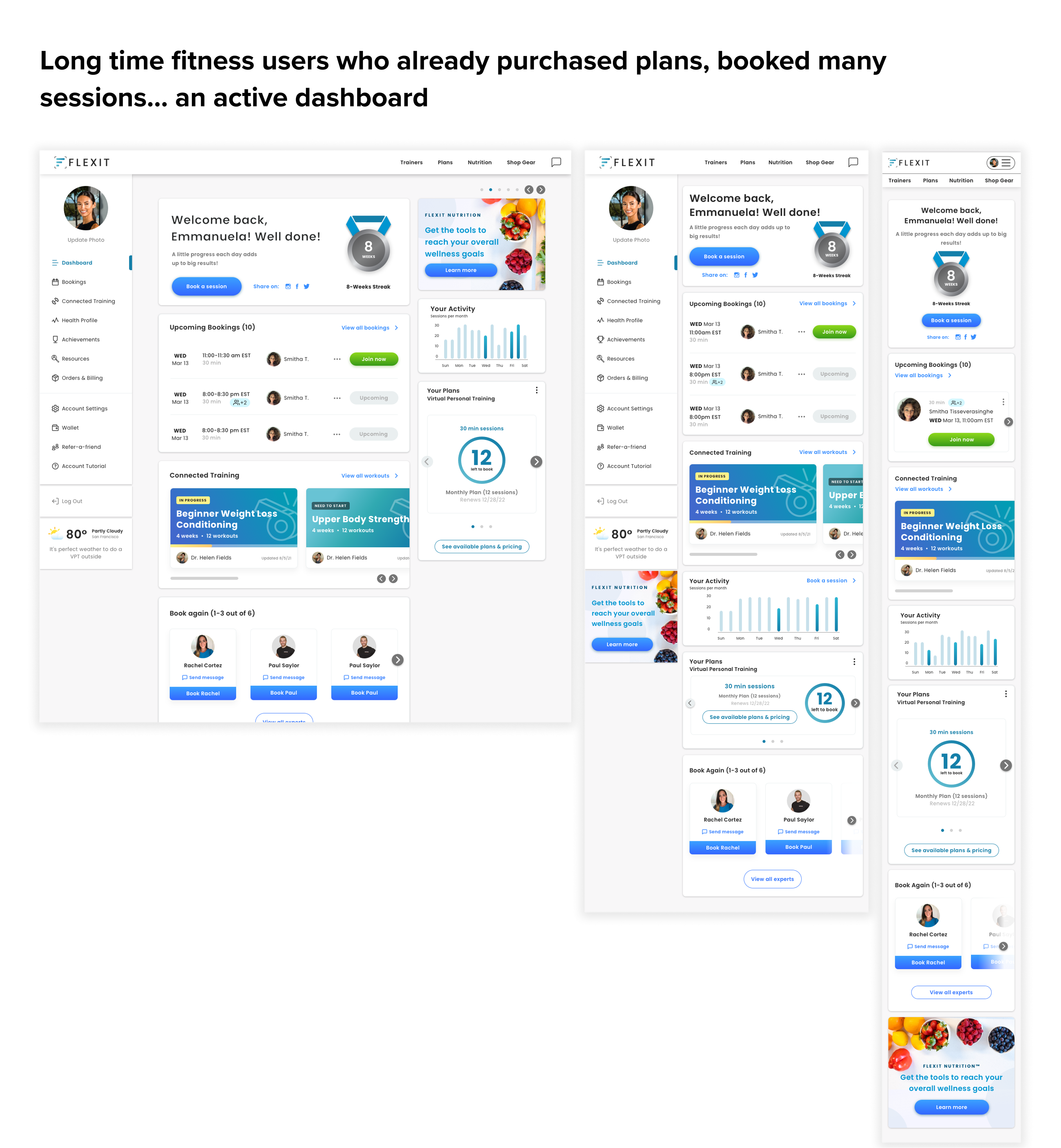
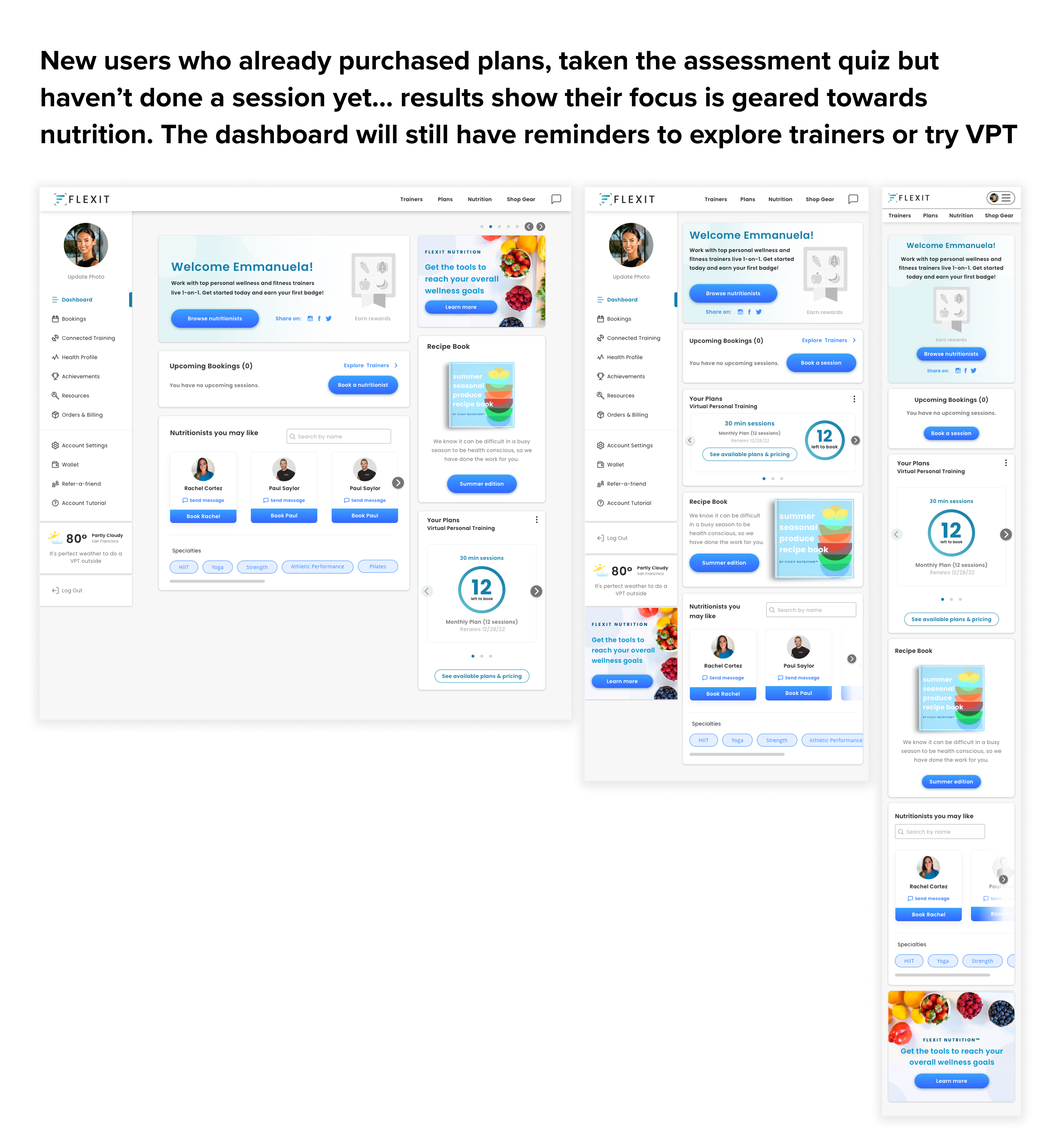
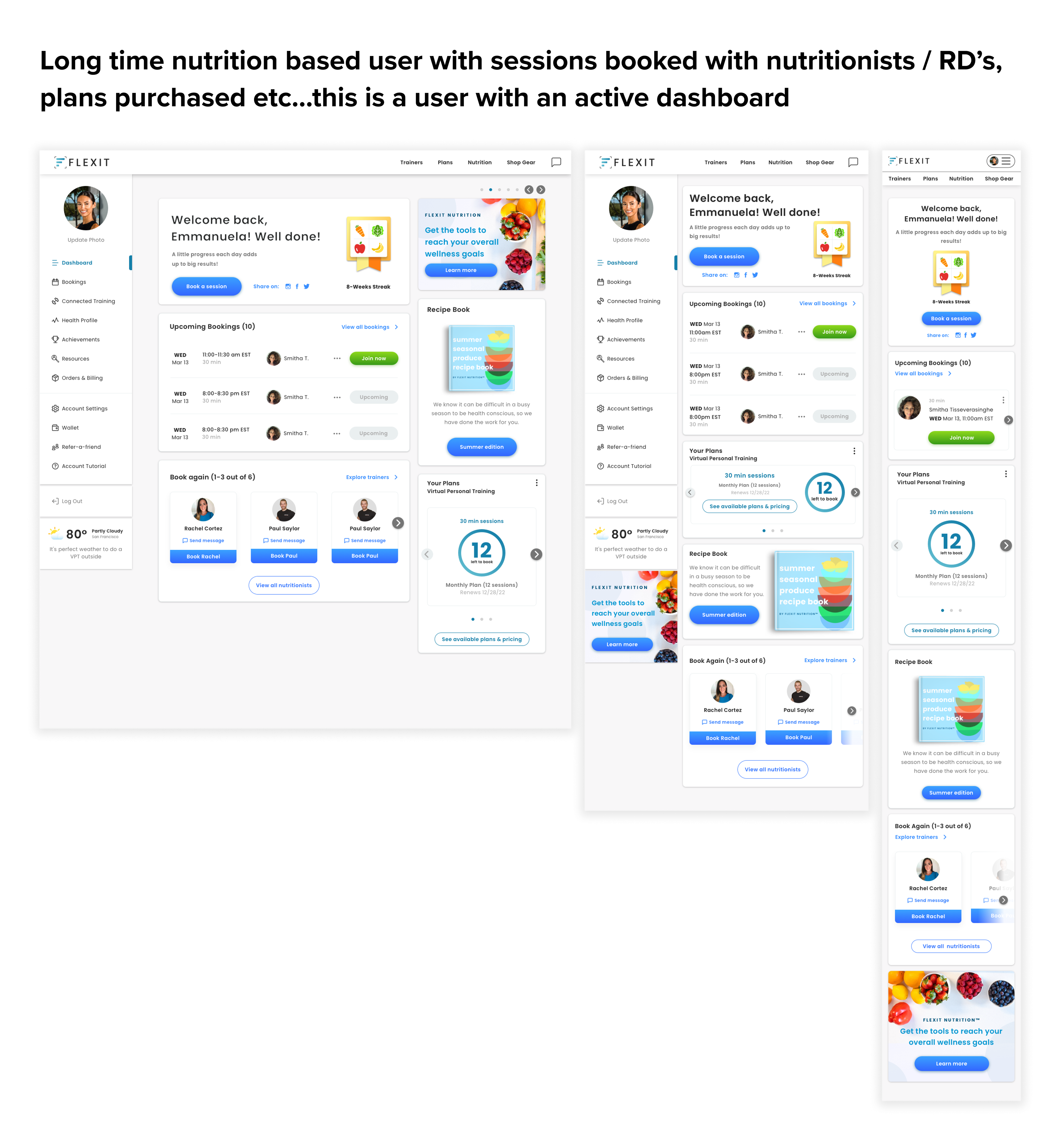
Post launch of the new dashboard, we received positive feedback from trainers, users and our CEO. The design refresh was now up to par with the growth of the company. With the dashboard redesign being well received (with some minor tweaks as more people were getting acclimated to the new layout), the ux/ui design team got the green light to continue redesigning and restructuring more categories within the user account..like bookings, achievements, health profile and more.
There was also discussions to create more of an experience for the FlexIt user by creating new categories like Wellness Challenges and a Leaderboard in the near future.
One of the main focuses for us in terms of next steps, was enhancing the Health Profile. This section was utilized the least if at all and we wanted it to be a place where users and trainers could communicate and track progress and goals. We wanted to encourage them to utilize this space more for their advantage and convenience instead of using other software and tools to log their progress.

